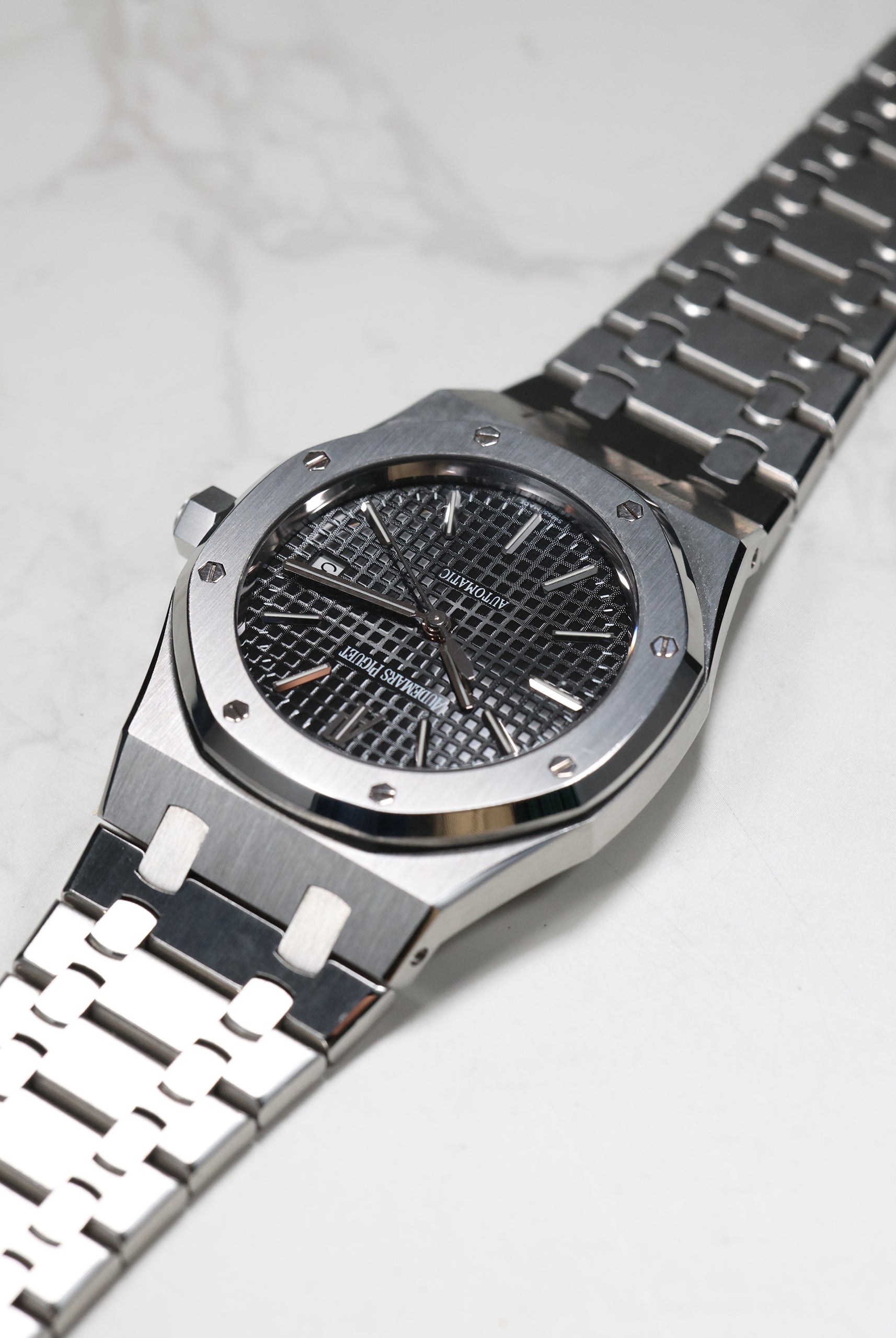
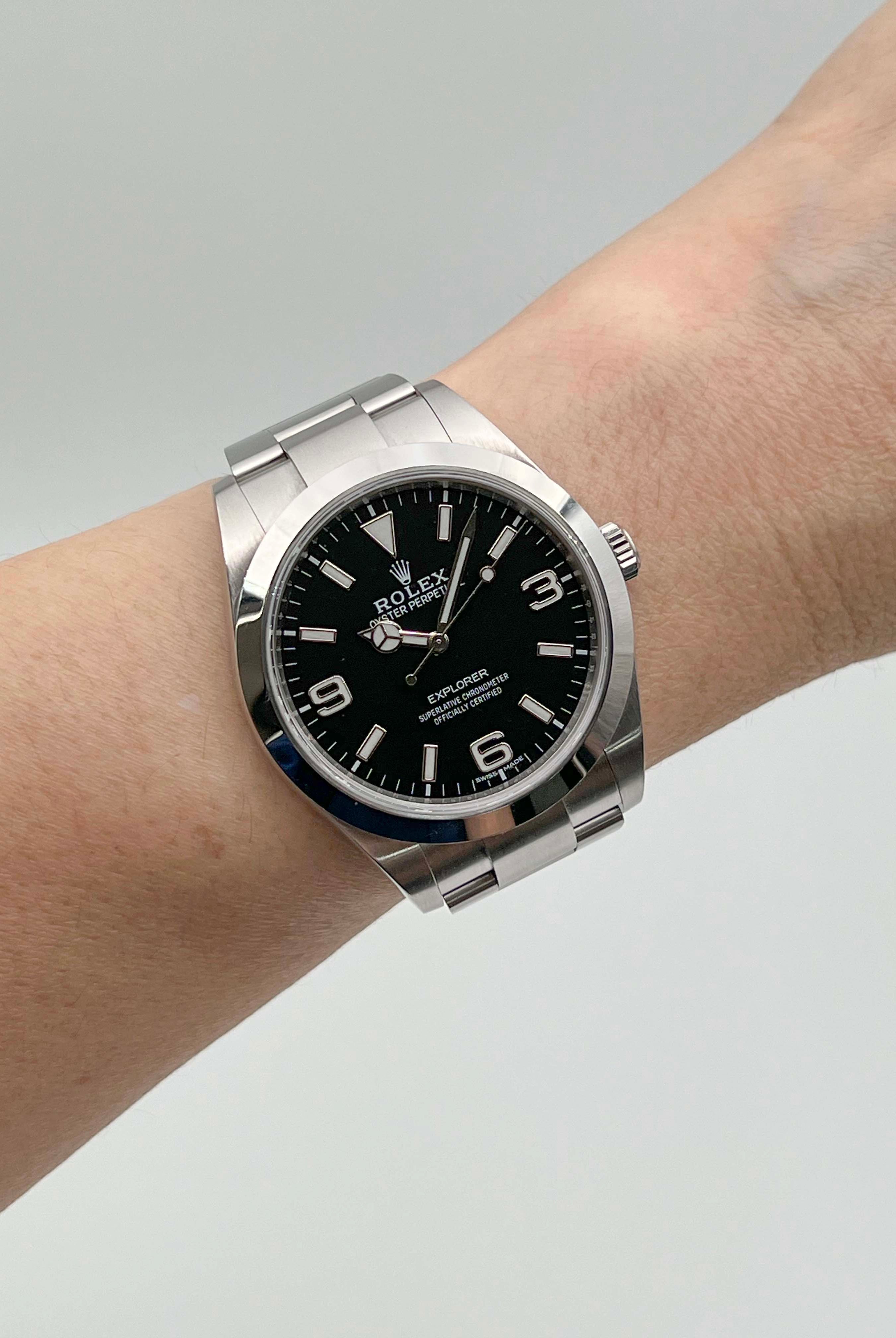
For most of the 20th century, watchmaking lived under a simple, practical truth: dials were black because they needed to be. Pilots relied on maximum contrast, divers needed clarity underwater, and engineers required instant readability. Black wasn’t aesthetic — it was functional — and that purposeful simplicity defined an entire era of tool watches.
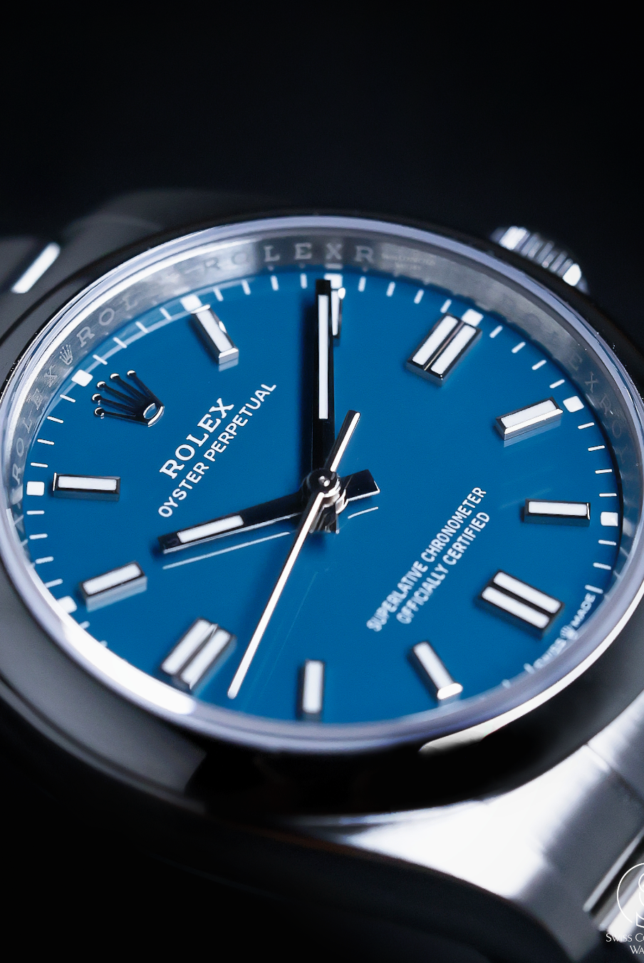
When mechanical watches re-emerged as luxury objects in the early 2010s, collectors sought individuality. Blue rose to prominence and dominated a decade. From the Nautilus to the Submariner, it became the new default for luxury: photogenic, versatile, quietly expressive.
By the mid-2020s, a different colour stepped forward.
Green arrived not as a trend, but as an evolution — a hue rich in character, adaptable in mood, and deeply nuanced. And unlike blue, green transforms dramatically depending on its finishing:
-
Lacquered greens feel elegant and fluid.
-
Matte greens project utility and clarity.
-
Gloss greens deliver purity and intensity.
-
Sunburst greens dance with light.
-
Sapphire-layered greens bring architectural depth.
This versatility has made green the most expressive colour of contemporary watchmaking. Here, we present nine compelling interpretations, each chosen for its craftsmanship, personality, and the story it brings to the wrist.
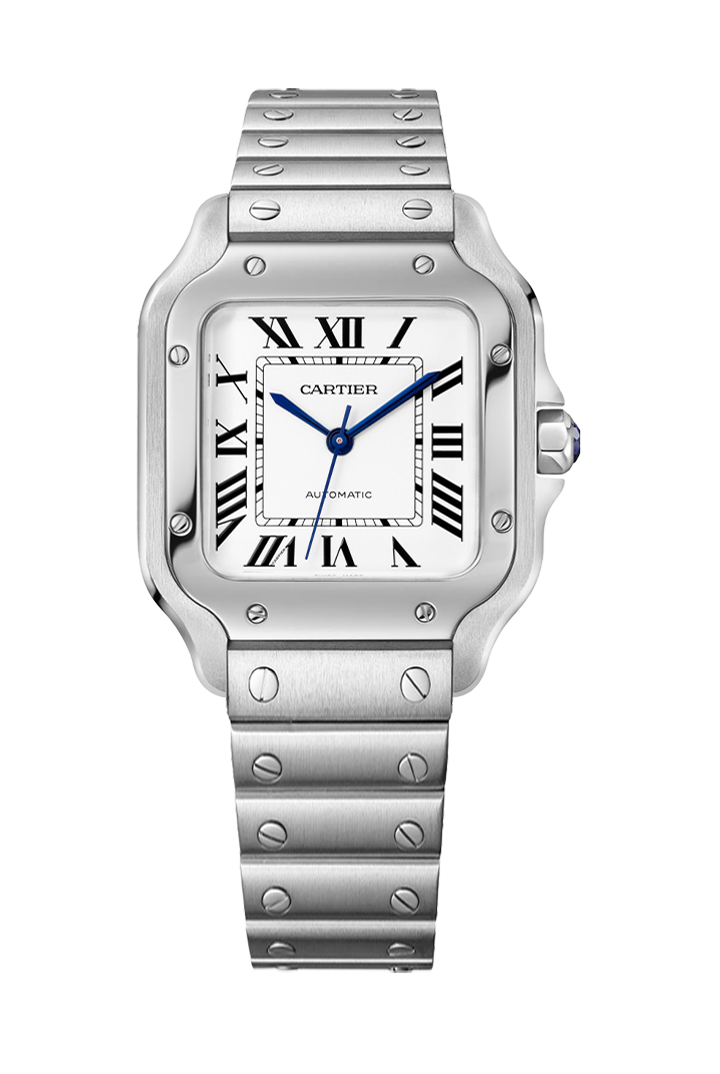
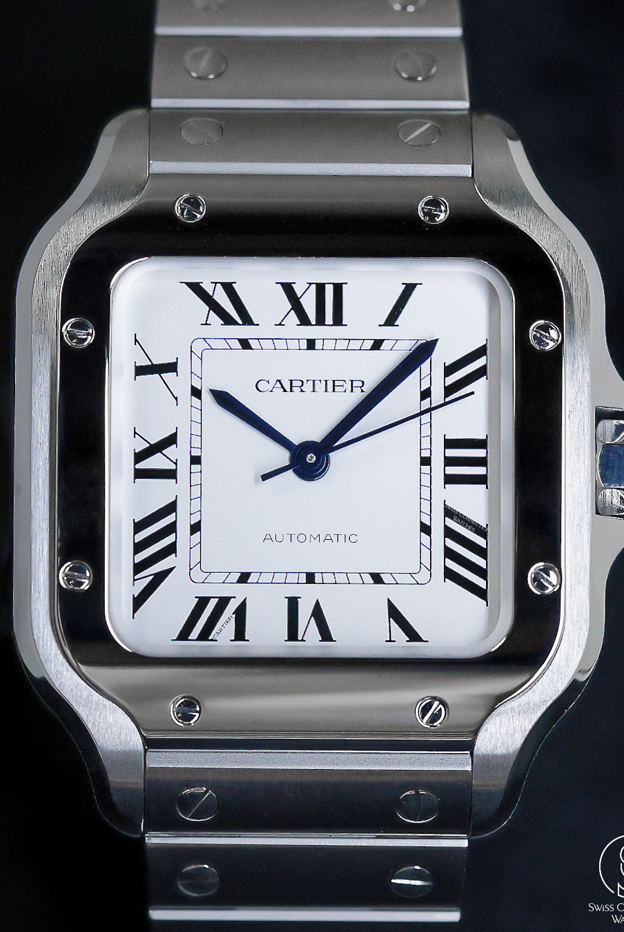
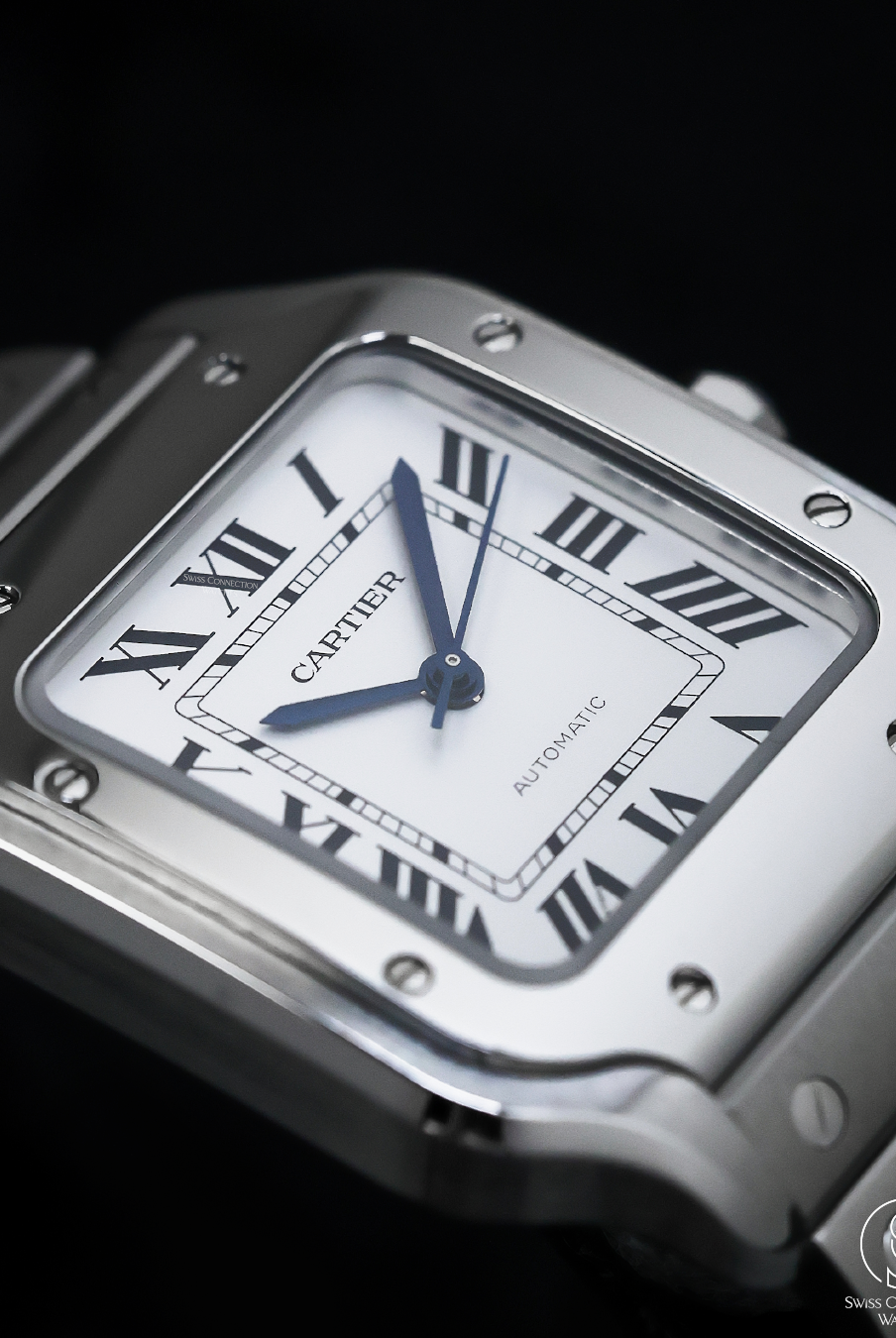
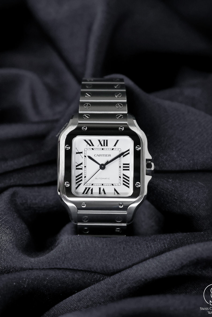
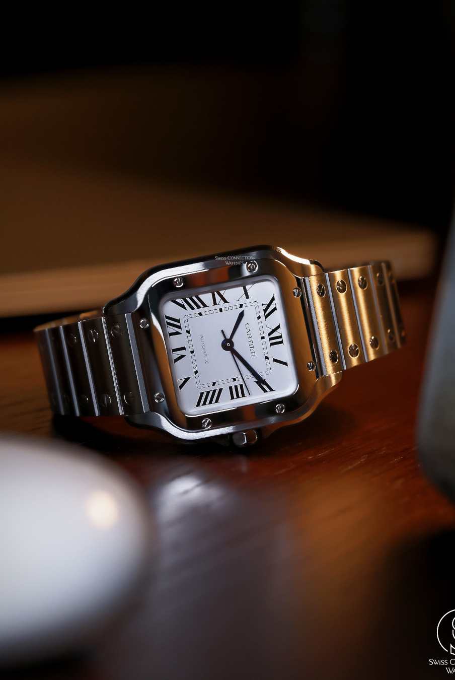
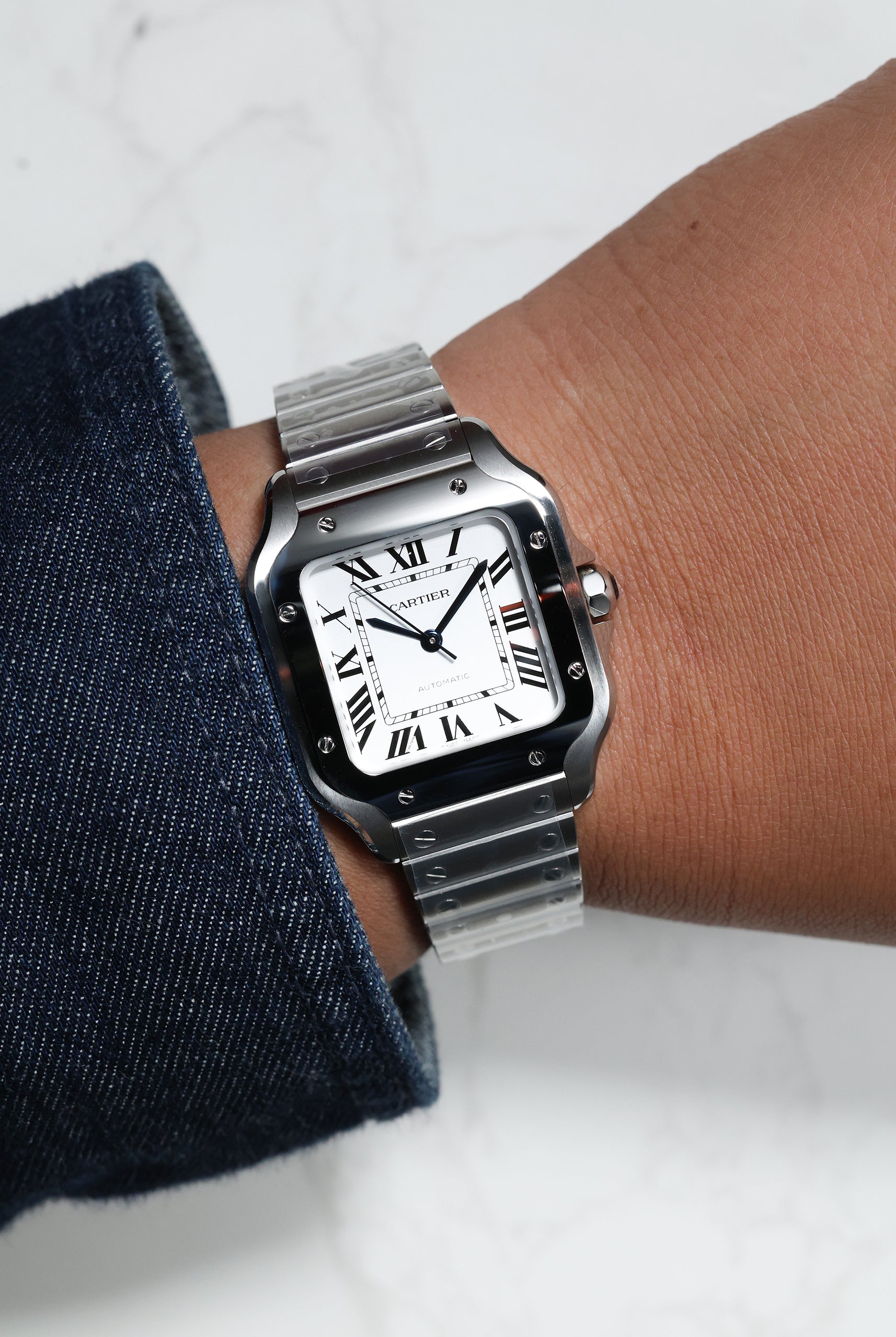
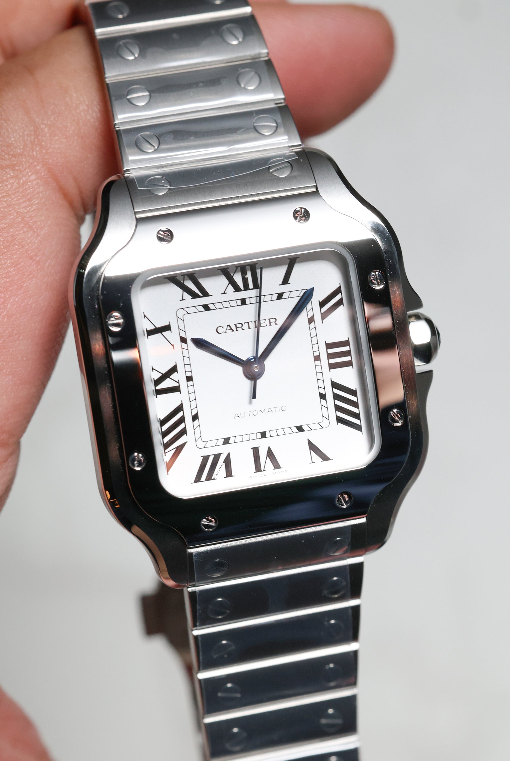
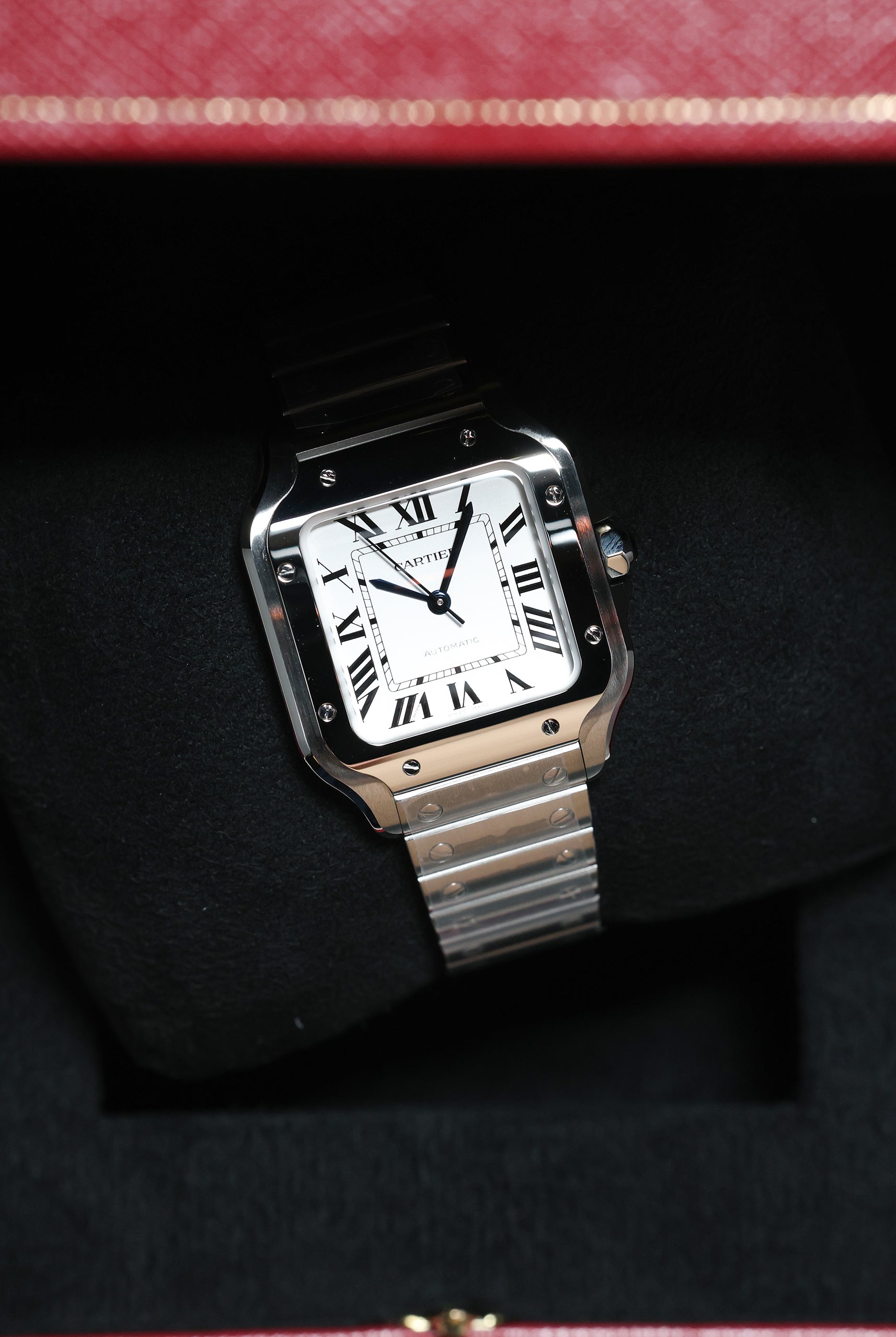
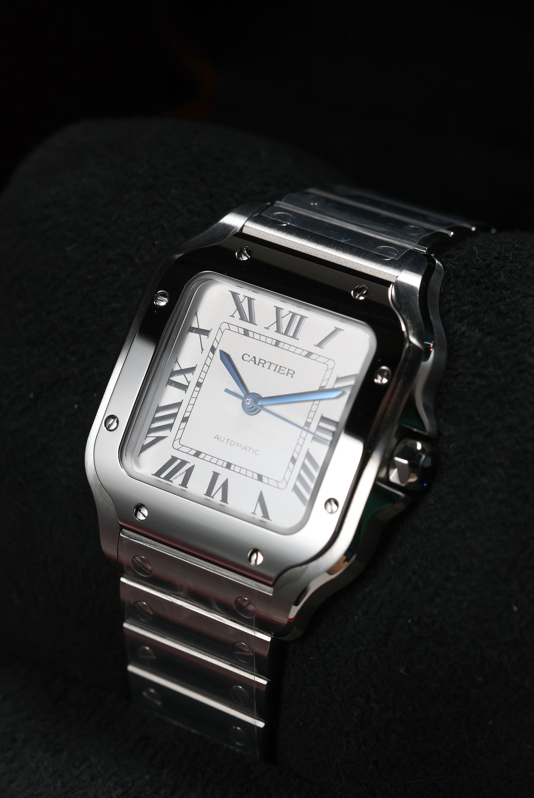
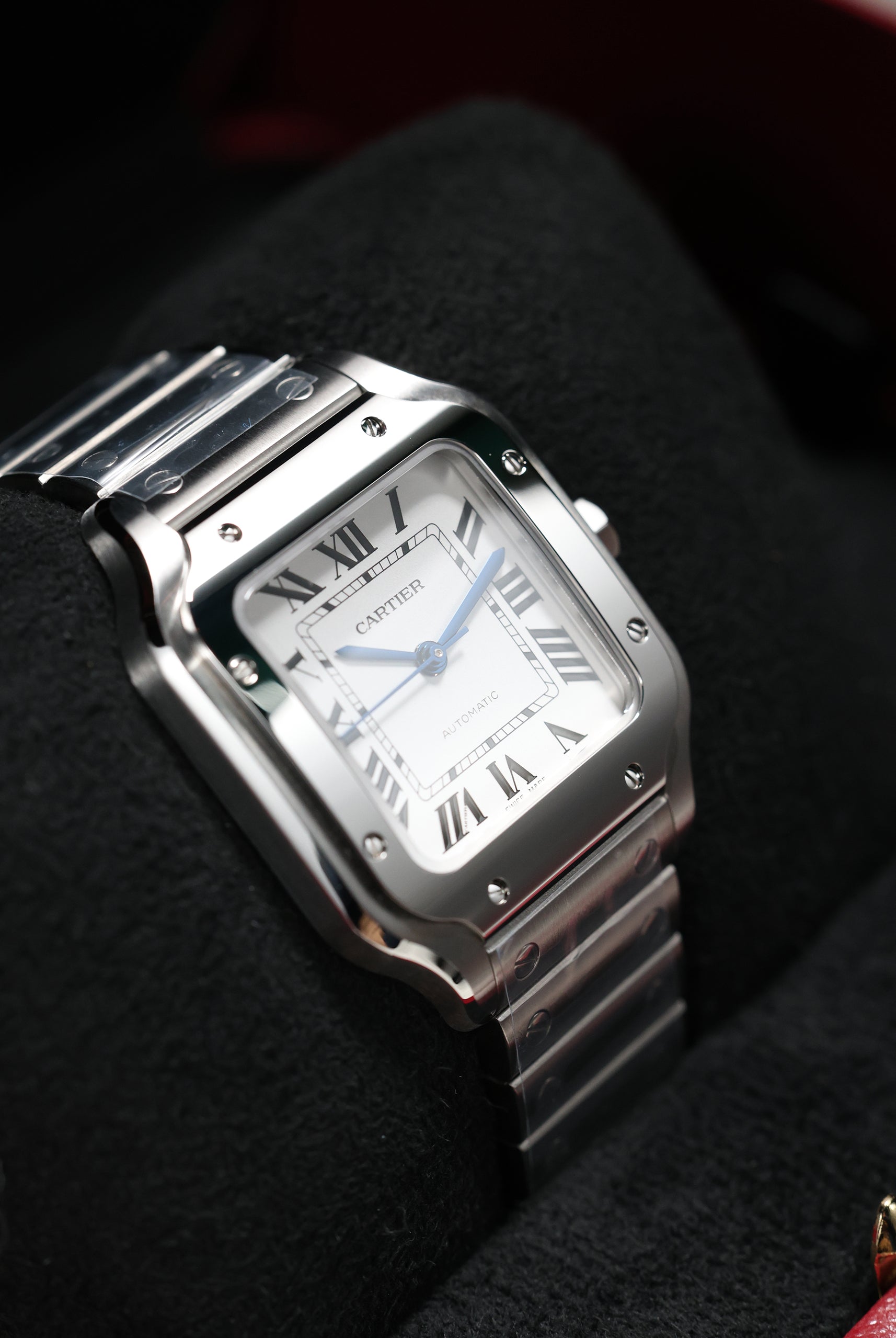
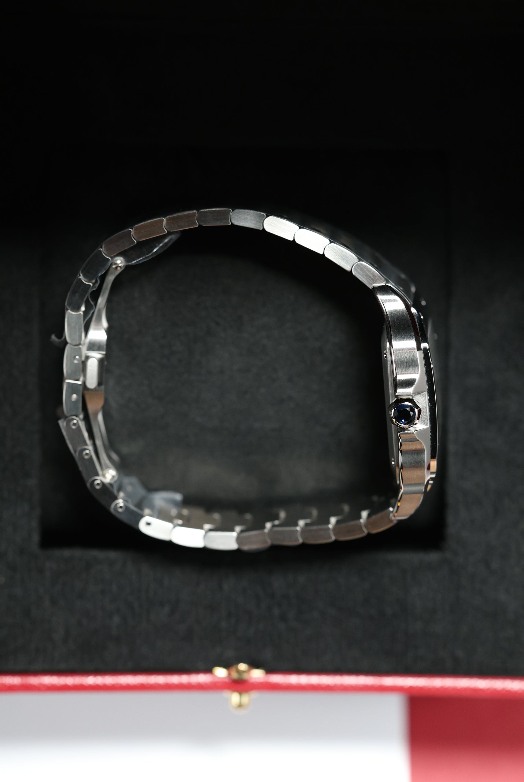
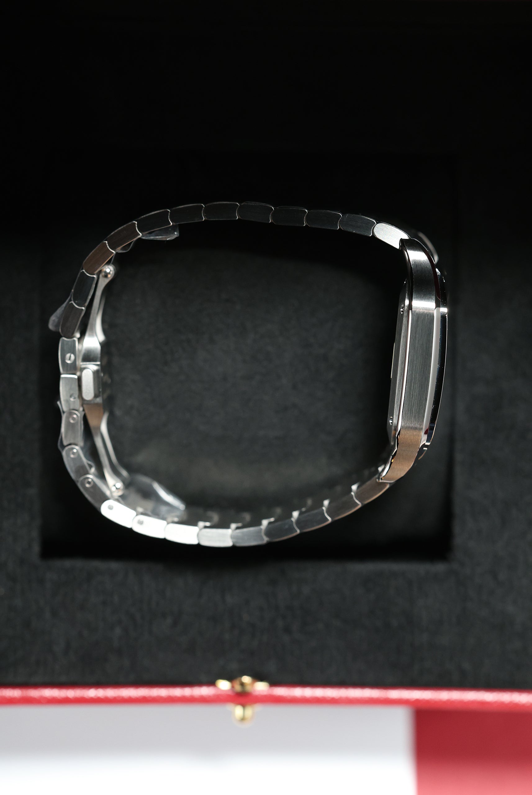
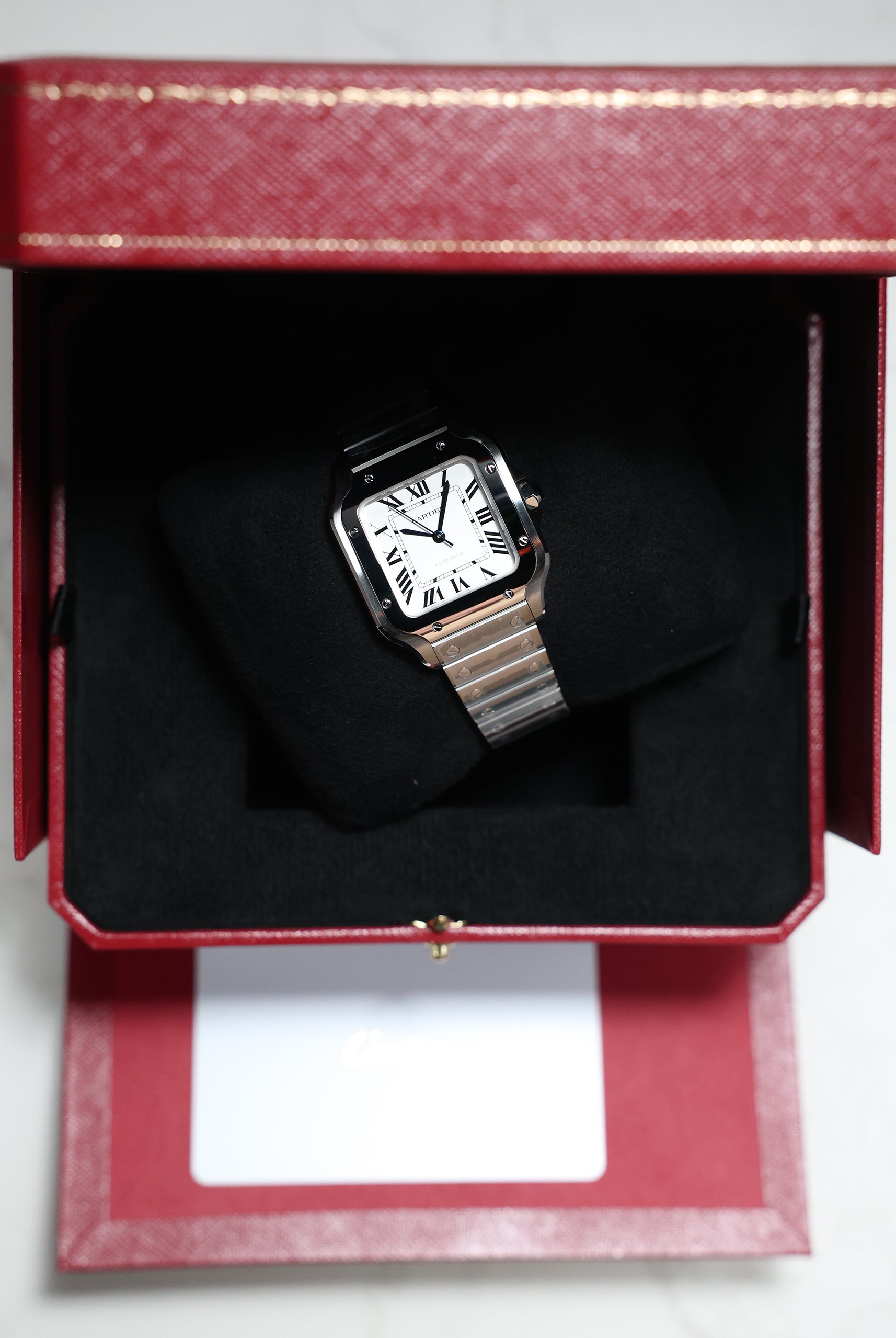
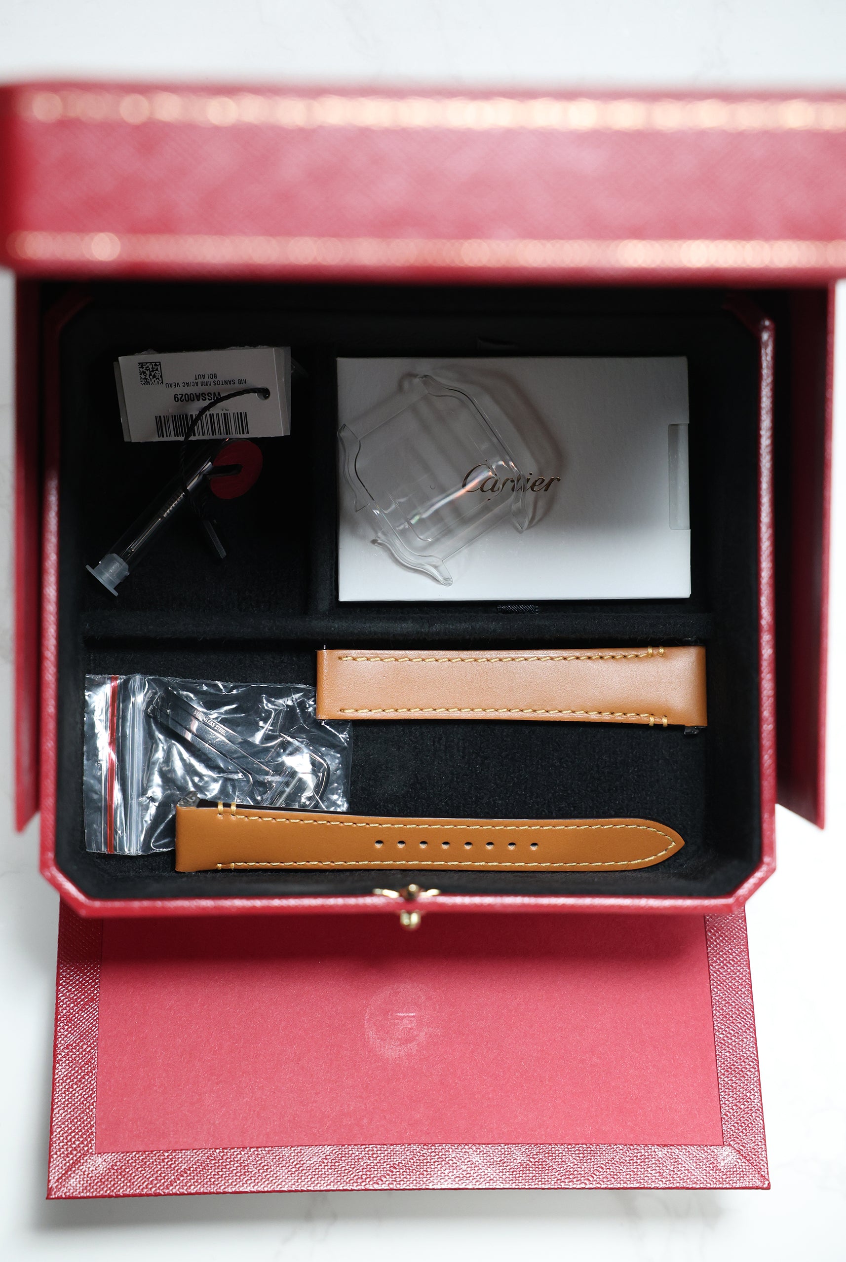
1. Cartier Santos Large Green Dial (WSSA0062)
Cartier built its legacy on the elegance of shape and proportion. The Maison uses colour the same way it shapes metal — as a quiet amplifier of proportion and elegance, ensuring the dial complements the architectural beauty of the case. By introducing sunburst greens, Cartier appeals to the luxury consumer who desires a touch of colour without sacrificing the watch’s iconic, structural integrity.
For collectors who favour subtlety with architectural balance. Cartier’s sunburst green is discreet yet captivating, shifting beautifully across the Santos’ iconic square case and linear screws. It elevates the watch without overshadowing its core design — a luminous, understated green that understands proportion and is made for quiet luxury.
2. IWC Pilot’s Watch Mark XX “Mercedes-AMG PETRONAS” (IW328210)
IWC Schaffhausen, the maker of uncompromising pilot’s watches, uses colour to inject dynamic energy into its most rigid designs. Its partnership with the Mercedes-AMG PETRONAS Formula 1 team proves that technical precision and vibrant aesthetics can share the same cockpit. This approach allows collectors to wear a piece of engineering history, now expressed with vibrant, contemporary momentum.
For the enthusiast who wants colour with technical energy. The PETRONAS green is a vibrant, characterful matte tone that brings speed and precision to the classic Mark XX lineage. This matte finish is deliberately chosen for its non-reflective purity, ensuring maximum legibility, a hallmark of IWC's pilot history.
3. Girard-Perregaux Laureato 42mm Green Dial (81010-11-3153-1CM)
Girard-Perregaux’s Laureato is a pillar of 1970s luxury sport watch design. To stay visually distinct in today’s integrated-bracelet landscape, GP lets its striking colours speak alongside the signature Clous de Paris dial pattern. This blend of rich texture and distinctive colour ensures the Laureato stands out with confidence, honoring its historical mandate as an architectural sports watch.
For the collector who values integrated-bracelet design with characterful confidence. The Laureato’s green is bold, sculptural, and perfectly suited to its faceted octagonal bezel and integrated case. It offers both clarity and depth, making the colour feel alive with every movement—a striking architectural green with true 1970s sport-lux heritage.
4. MING 22.01 GMT Kyoto
MING is the quintessential modern independent, gaining notoriety through a relentless focus on architectural purity and innovative material use. The brand keeps itself at the cutting edge of design by using complex, unconventional methods—like layered sapphire—to create its signature translucent colors. This approach appeals directly to the collector who prioritizes artistic vision and is seeking a distinctly nuanced, technical expression of color beyond traditional dial paint.
For the modern independent-collector who values design purity. MING’s Kyoto green uses layered sapphire to create a soft, translucent jade tone. This innovative technique gives the dial architectural depth and a subtle, artistic modernity—a distinctly Malaysian interpretation of green from one of the world’s most exciting independents.
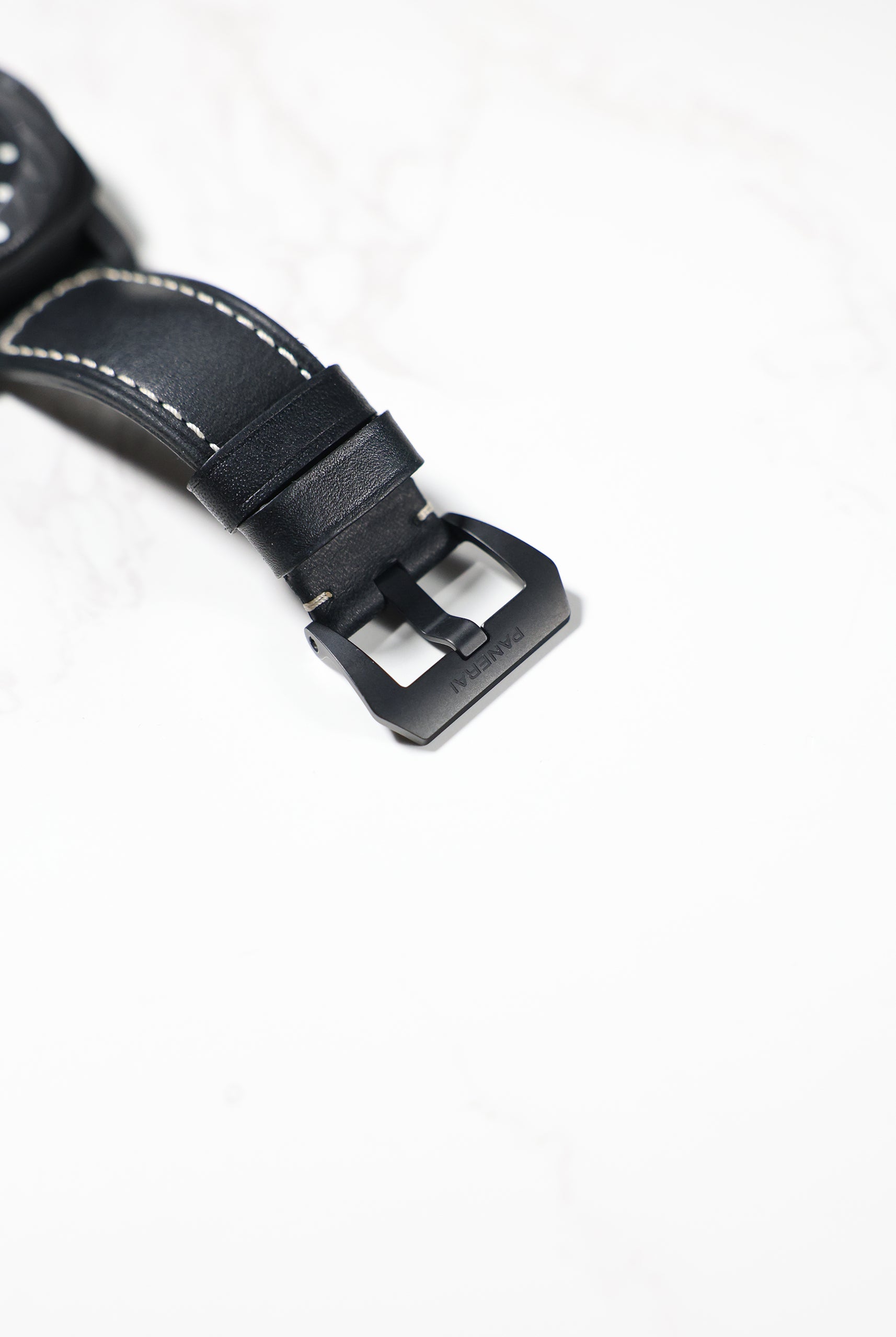
5. Panerai Radiomir California Brunito (PAM01349)
Born out of military necessity, Panerai’s identity is rooted in oversized, legible diving watches. To breathe new life into the historical Radiomir line, the brand uses colour and texture to convey raw authenticity and history. This distressed finish ensures a piece that feels authentically aged — more instrument than ornament.
For those drawn to history expressed through texture. Panerai’s matte, distressed olive tone reflects the Radiomir’s vintage military roots. Paired with the Brunito (patinated) steel case, the dial feels weathered and authentic — a green with character and grit. This raw, atmospheric shade feels lived-in and purposeful, capturing the essence of historical diving equipment.
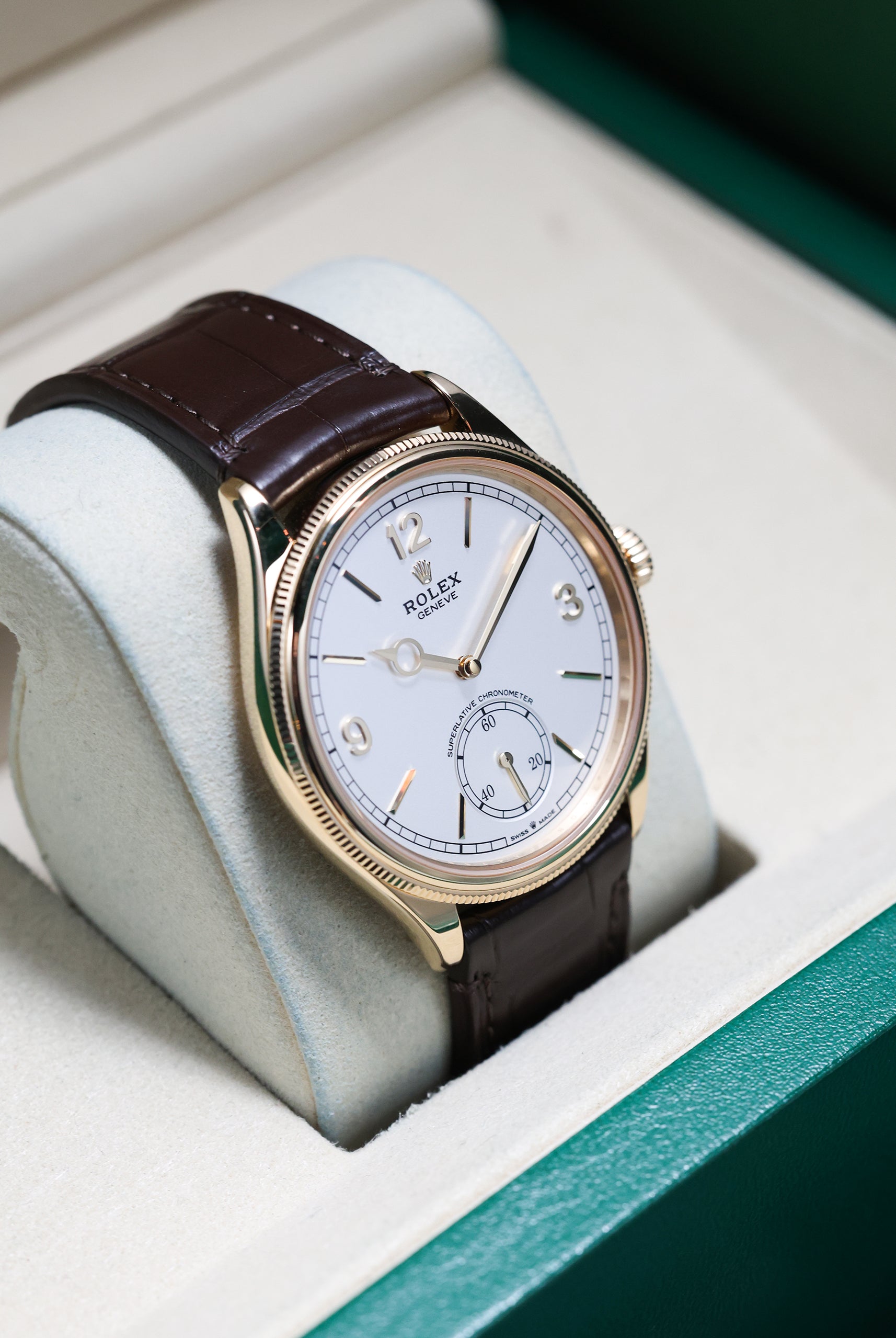
6. Patek Philippe Annual Calendar (5205R-011)
Patek Philippe operates at the pinnacle of haute horlogerie, where tradition is sacrosanct. The Maison introduces colour sparingly, only when it can enhance the movement's complexity and the case's timeless elegance. This understated olive green is a subtle acknowledgment of contemporary taste, deployed with the utmost sophistication.
For the collector seeking elegance shaped by light. Patek’s olive sunburst dial is a masterclass in elegance. Soft gradients shift subtly from deep olive to bronze to near-black at the edges, giving the complication a quiet, confident presence. It is green elevated through finishing rather than saturation, representing the most understated, dignified green in the luxury market.
7. Jaeger-LeCoultre Reverso Tribute Monoface Small Seconds (Q397843J)
Known as the "watchmaker's watchmaker," Jaeger-LeCoultre built its legacy on technical mastery and the Art Deco geometry of the Reverso. To refresh its iconic pieces, JLC uses highly saturated, lacquered colours. This deep finish provides an enamel-like richness that highlights the purity of the rectangular dial, bridging nearly a century of design heritage with modern tastes.
(Source from Jaeger LeCoultre)
For those who appreciate colour expressed through Art Deco elegance. The Reverso Tribute uses a deep, rich sunburst green that perfectly complements its rectangular, reversible case. Unlike sunburst or matte, this lacquer finish gives the dial immense depth and richness. On the wrist, it feels dressy, architectural, and unmistakably JLC, honoring its timeless design.
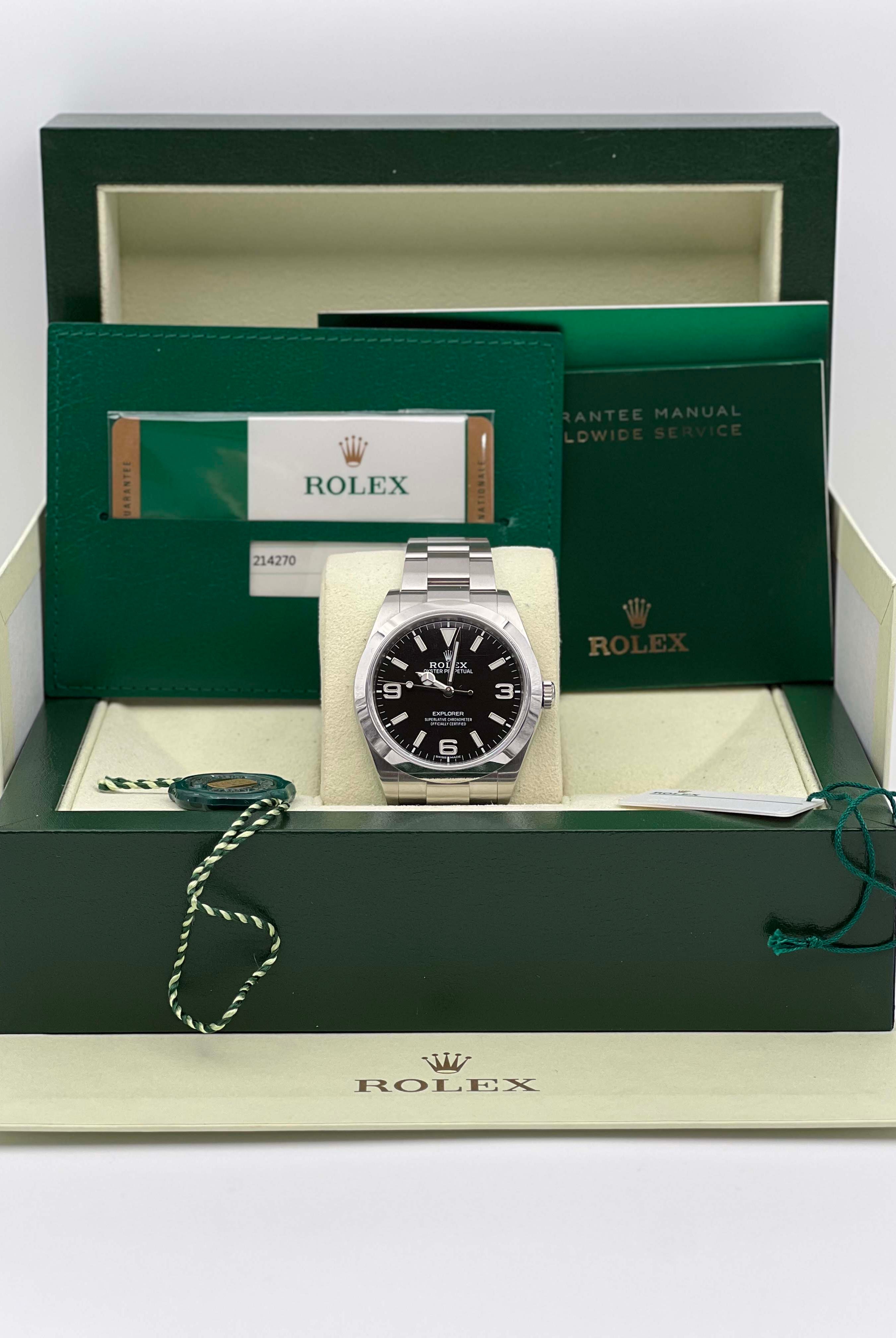
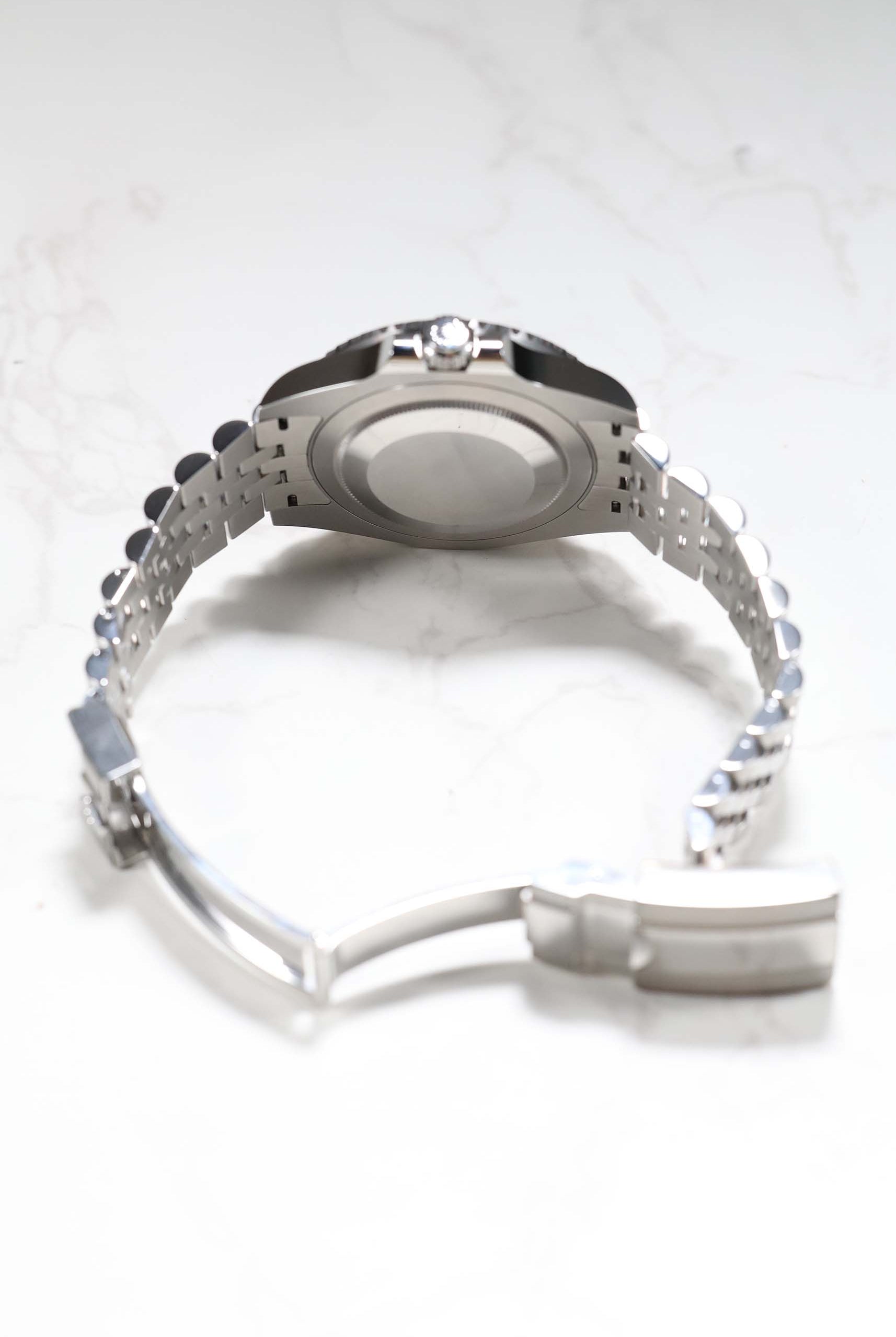
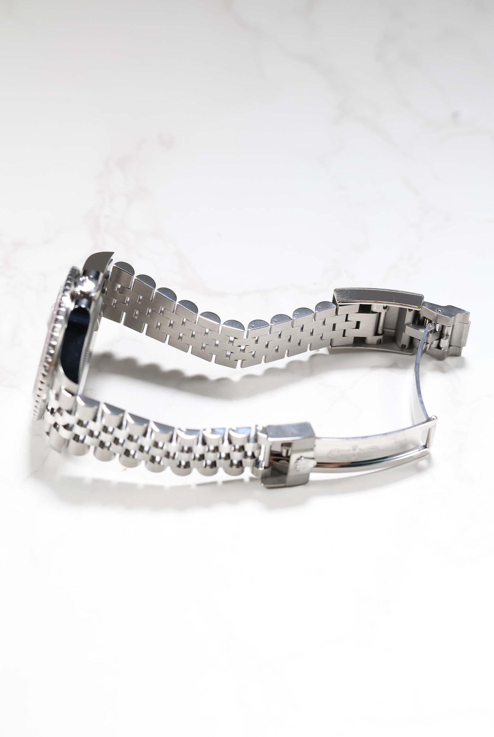
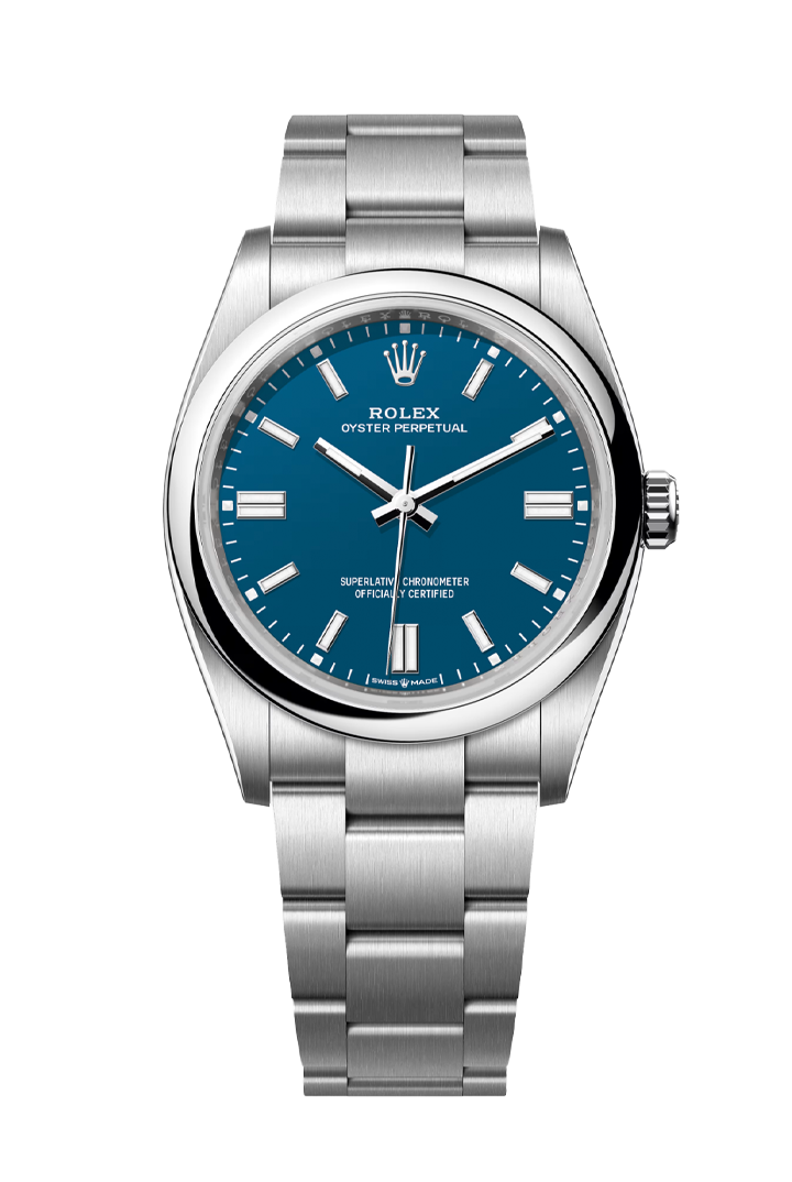
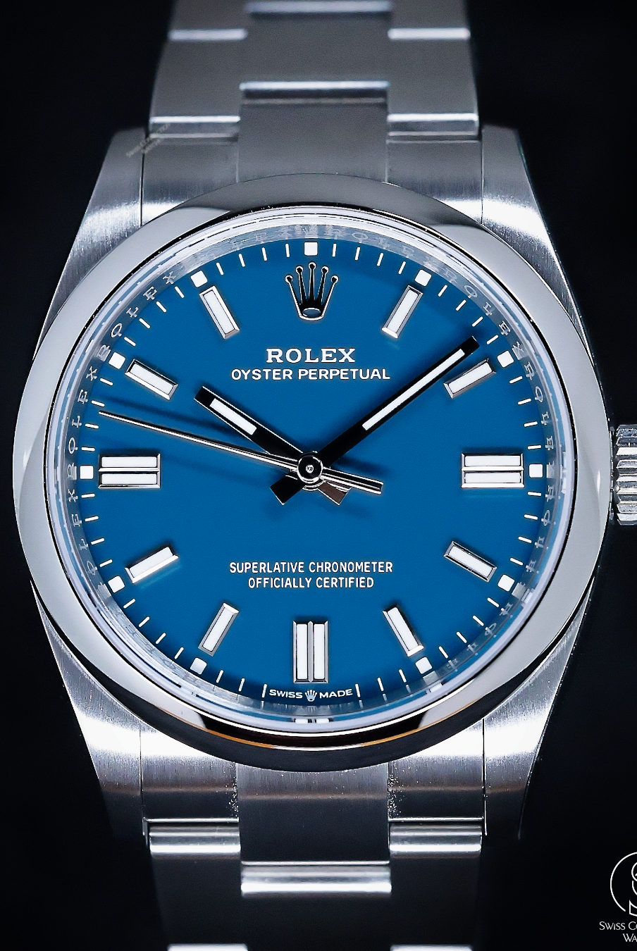
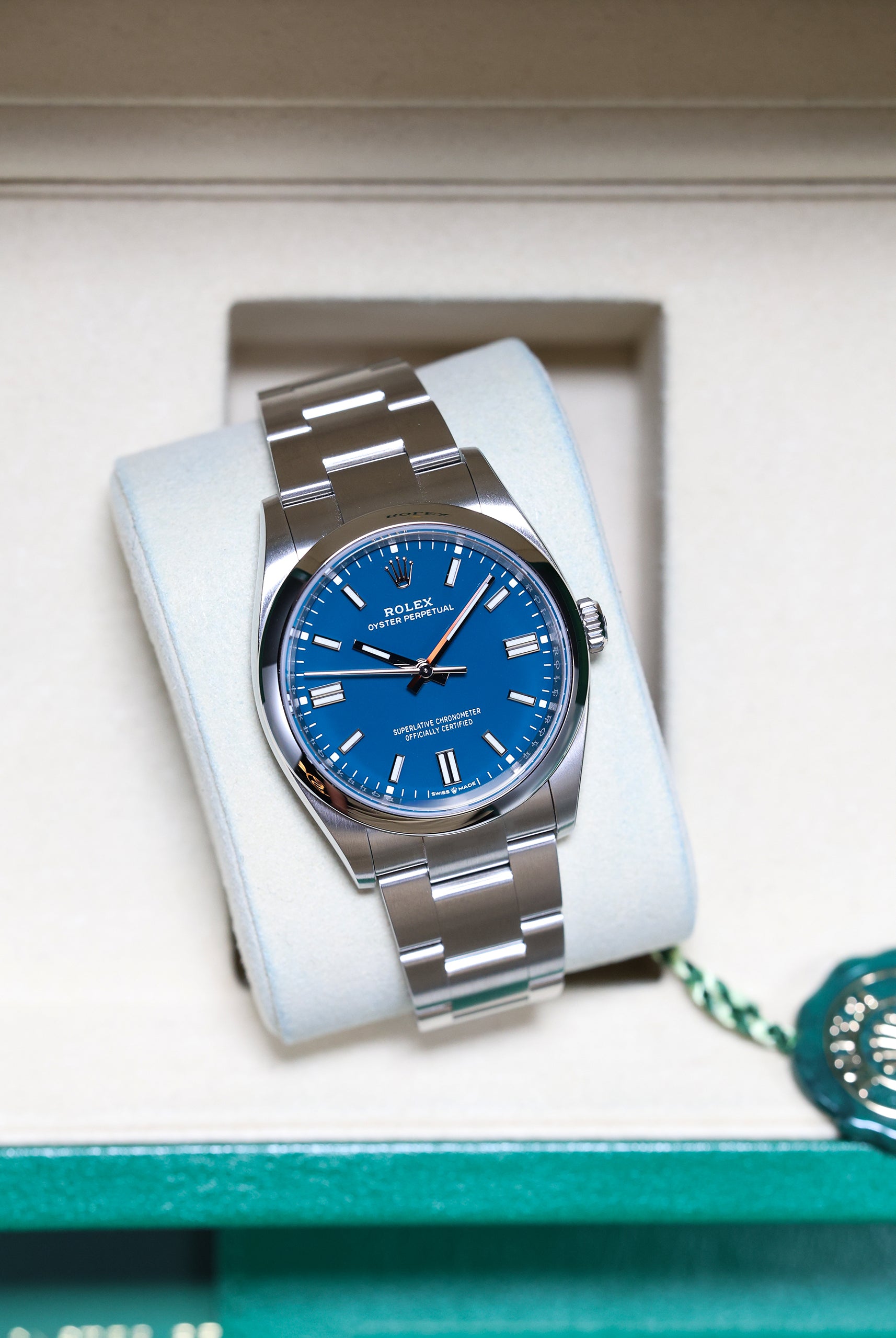
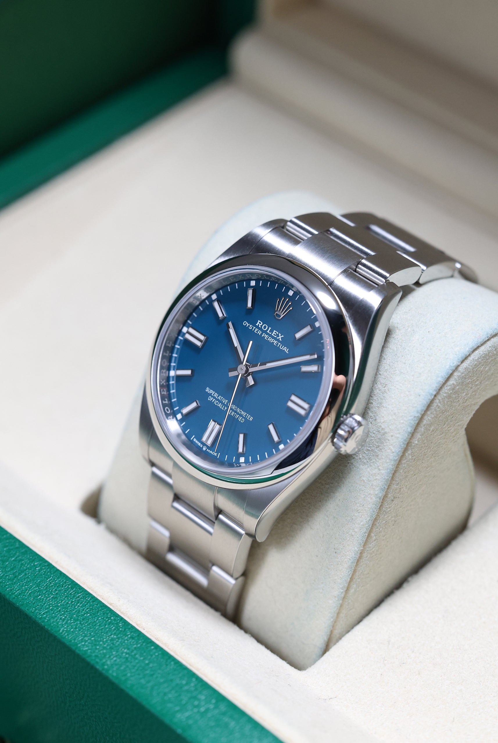
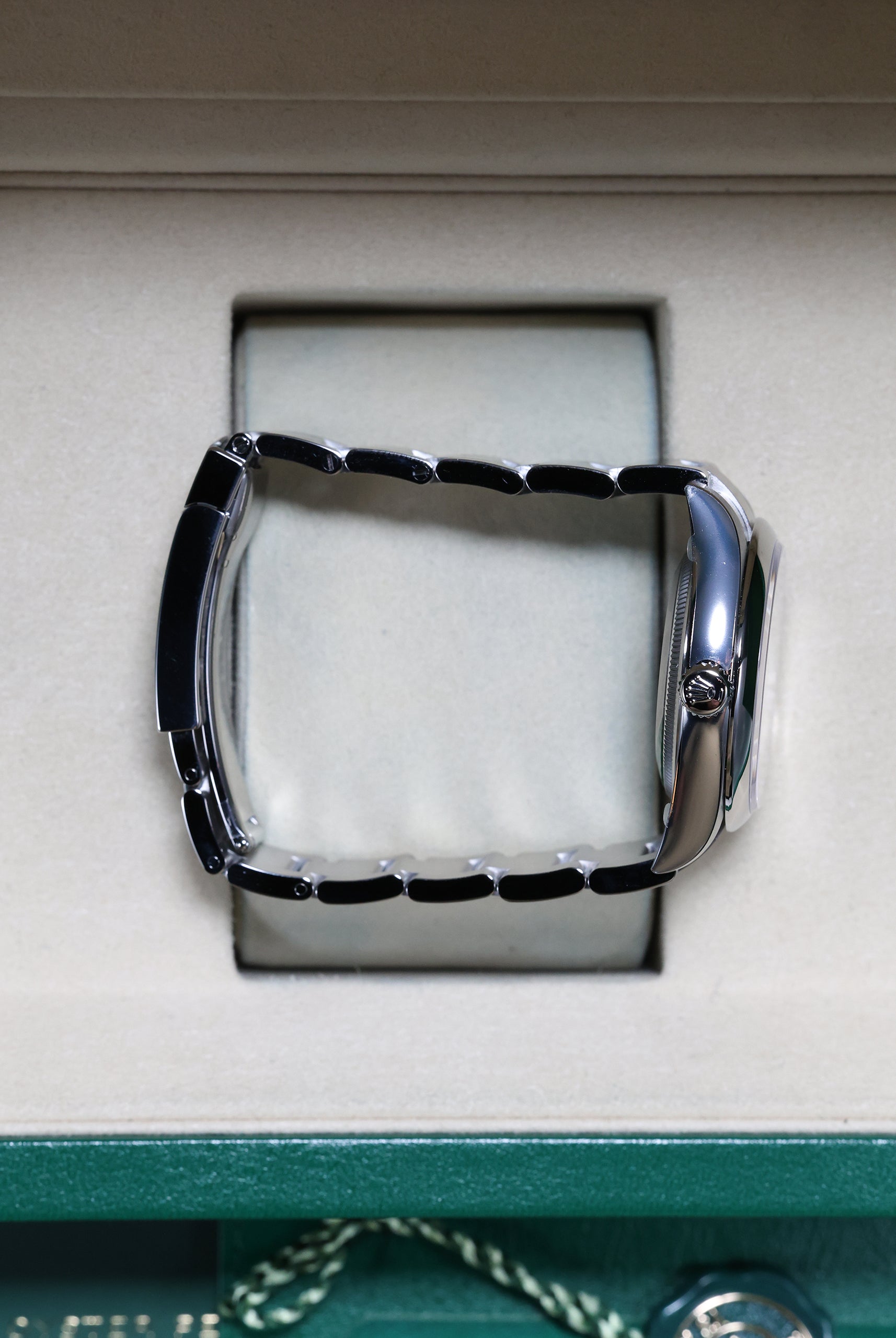
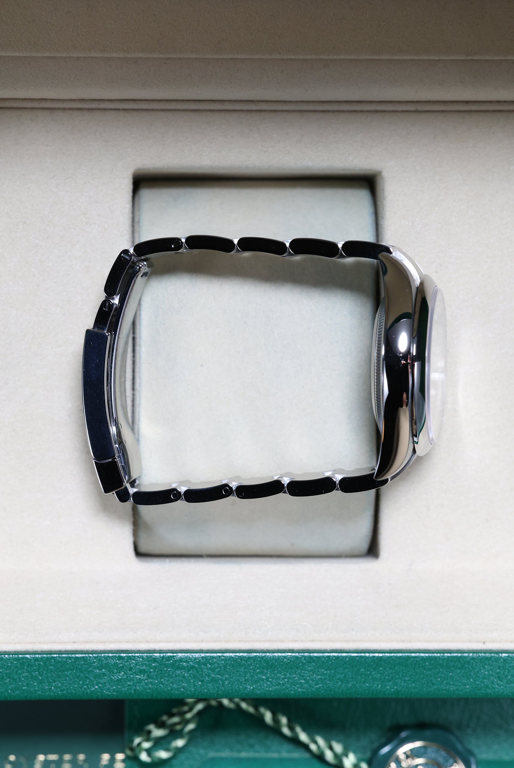
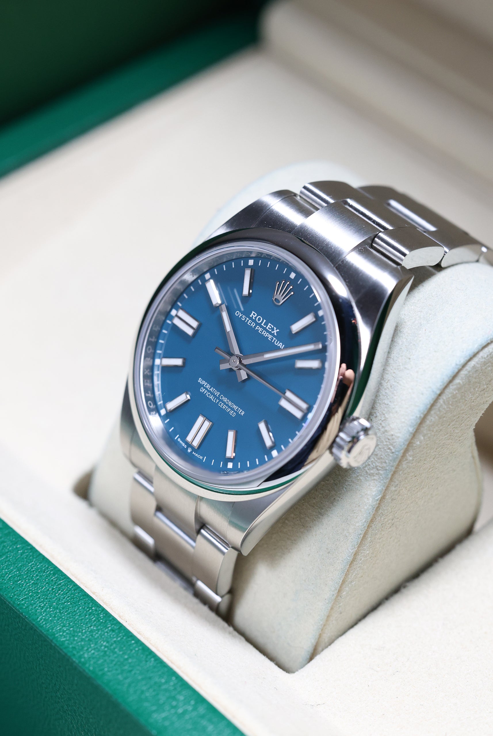
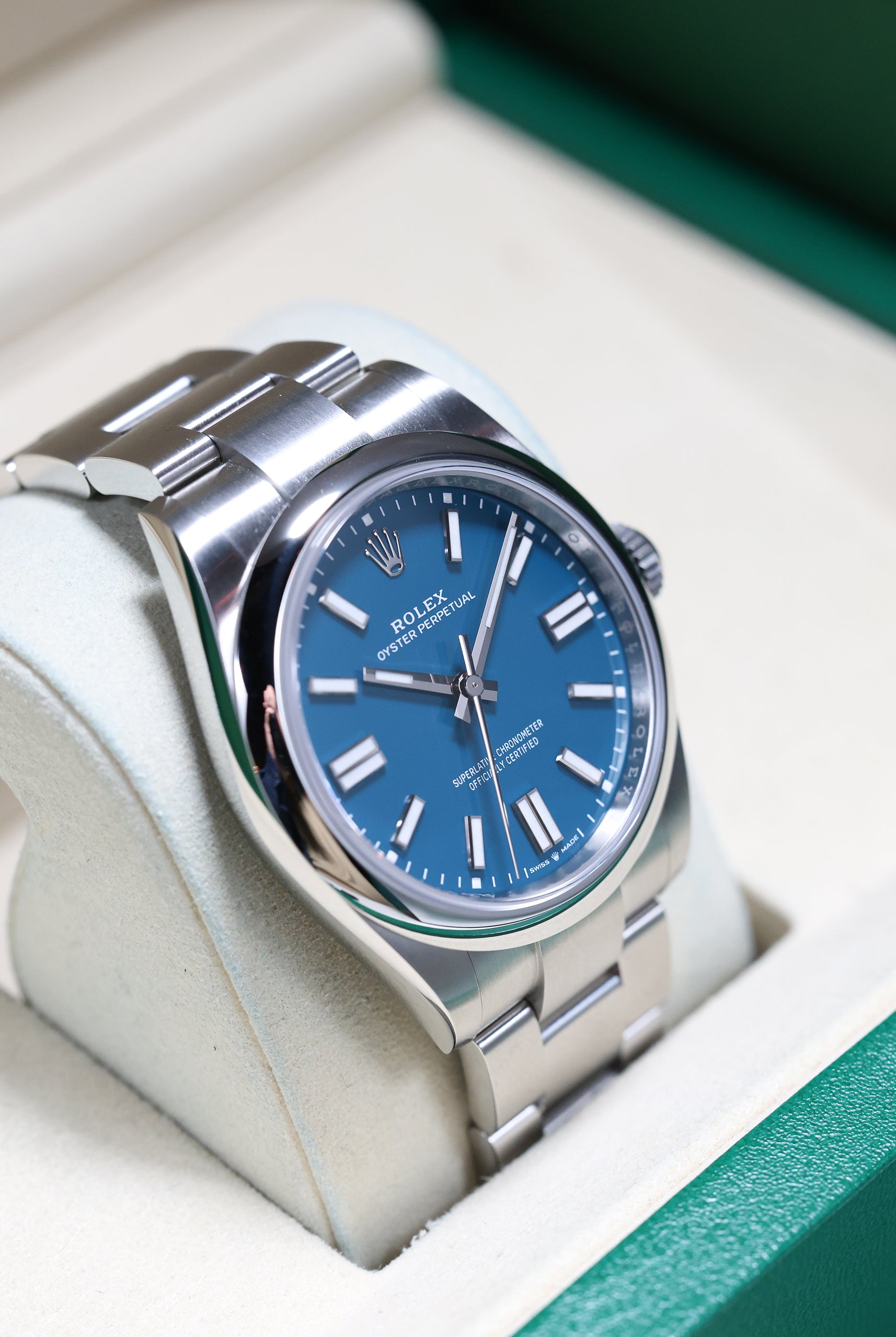
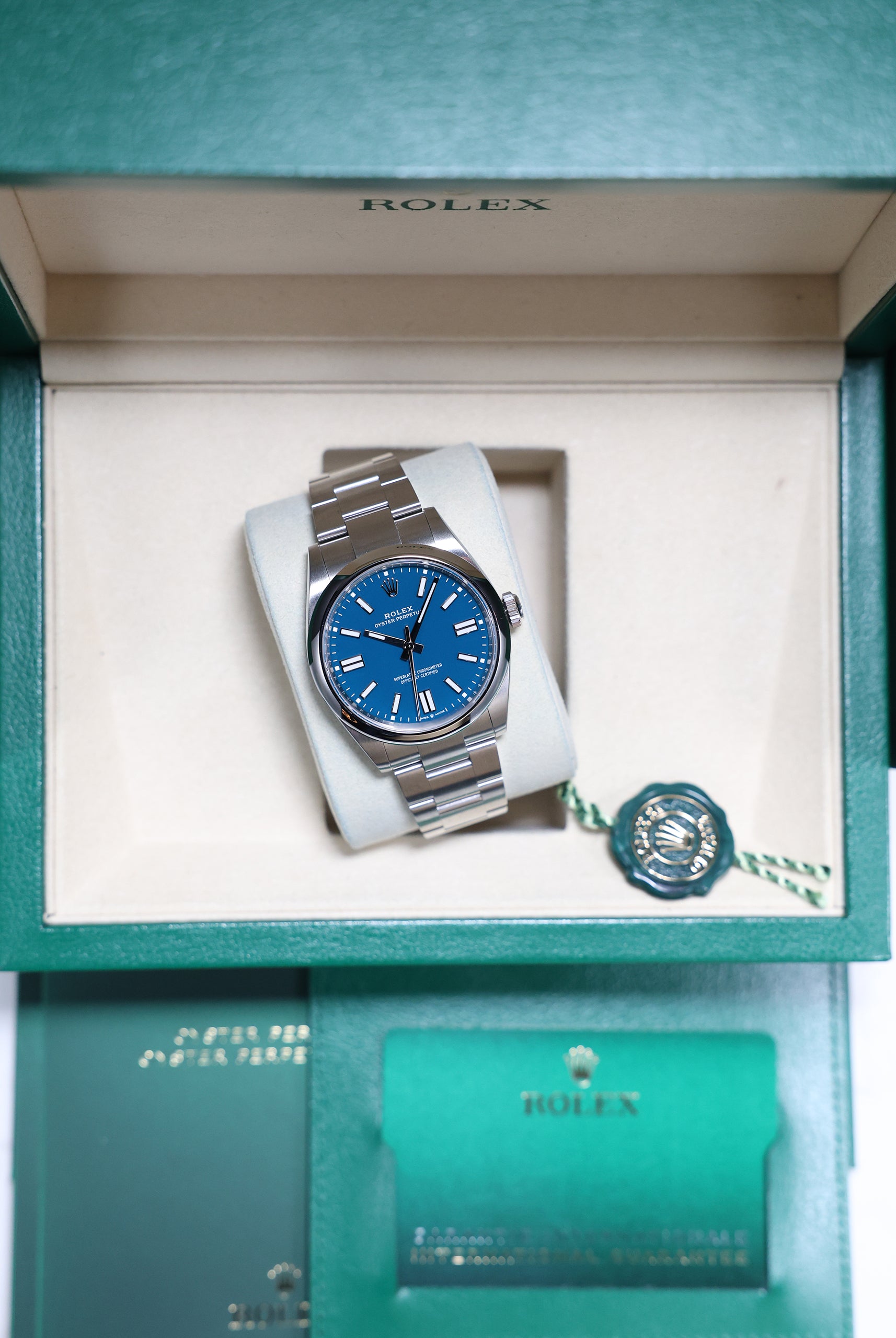
8. Rolex Oyster Perpetual “Pistachio” (e.g., 124200)
Rolex, the master of refinement, doesn't chase trends; it defines the standard. By subtly updating its colour palette on core models like the Oyster Perpetual and Datejust, it captures the discerning collector's desire for individuality without sacrificing the timeless proportions and quality that define the brand. The calculated introduction of greens—from the soft Mint to the bright Pistachio—is a slow, precise evolution that keeps Rolex at the forefront of desirability.
For the collector who wants the a unique green. The Pistachio OP uses a pure high-gloss lacquer dial — no gradients, no texture. This intense finish maximizes the colour's chroma and purity, delivering a statement piece that remains one of the most recognisable greens of the decade.
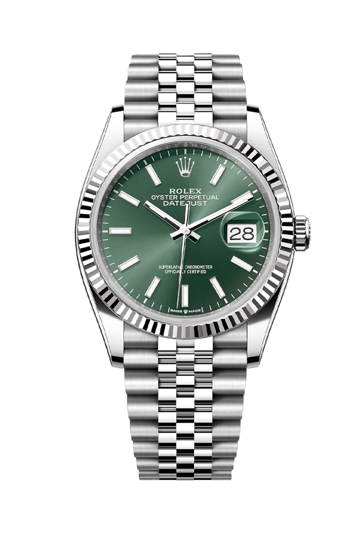
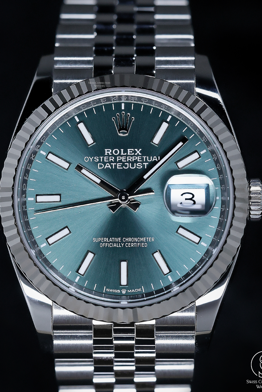
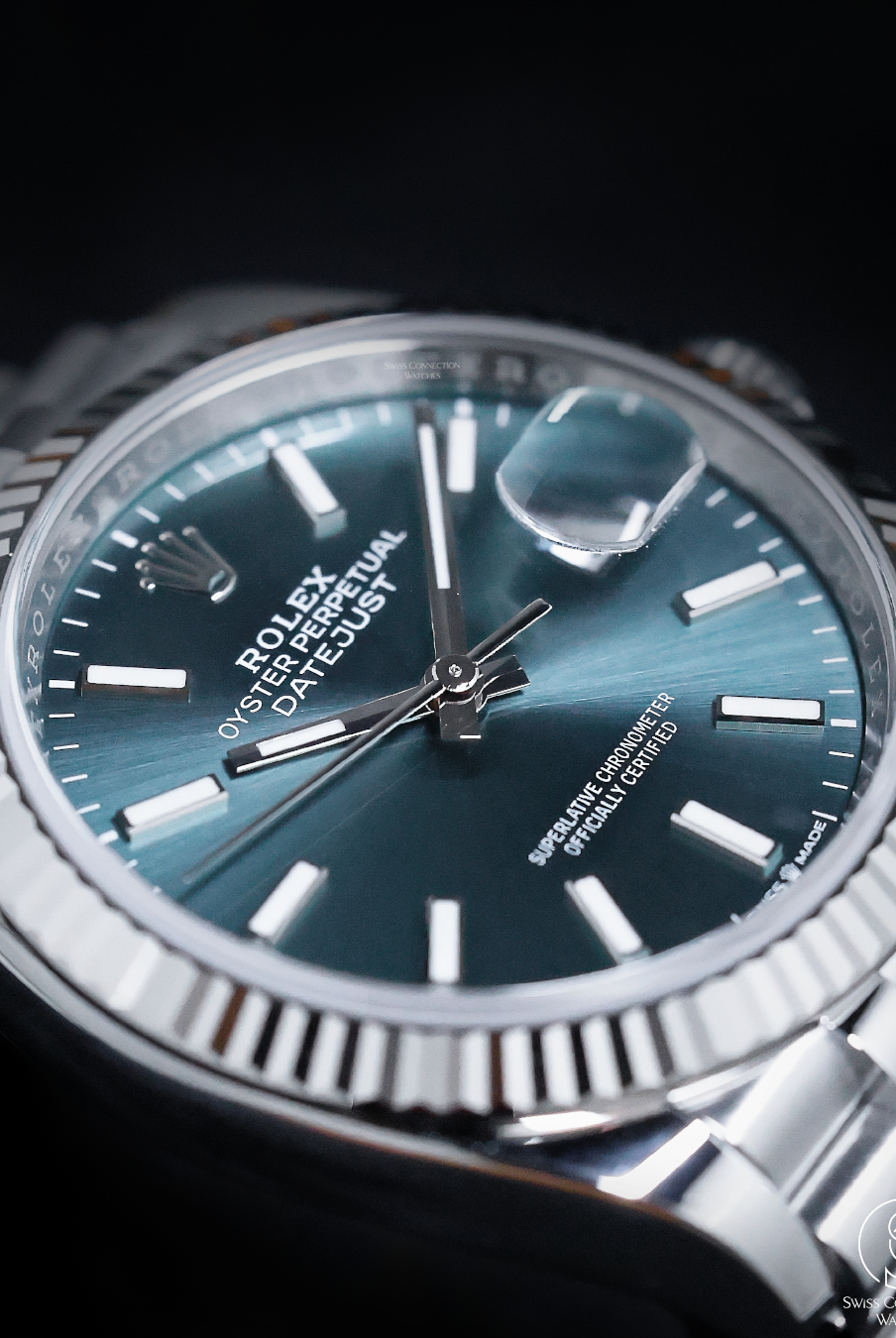
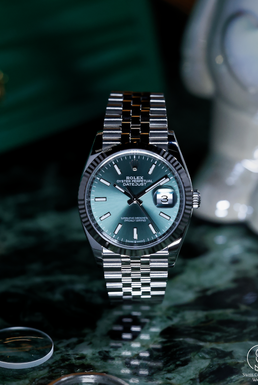
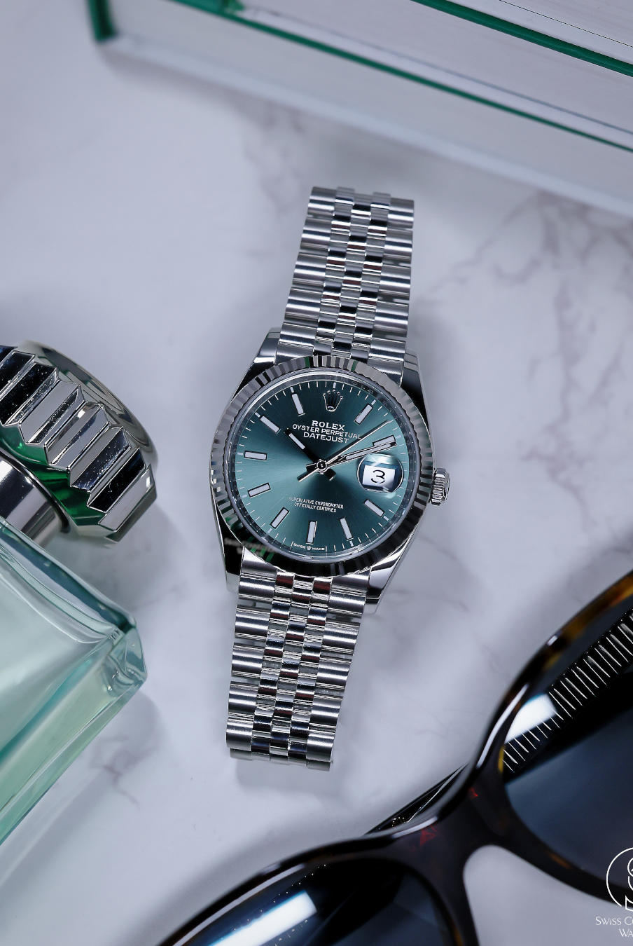
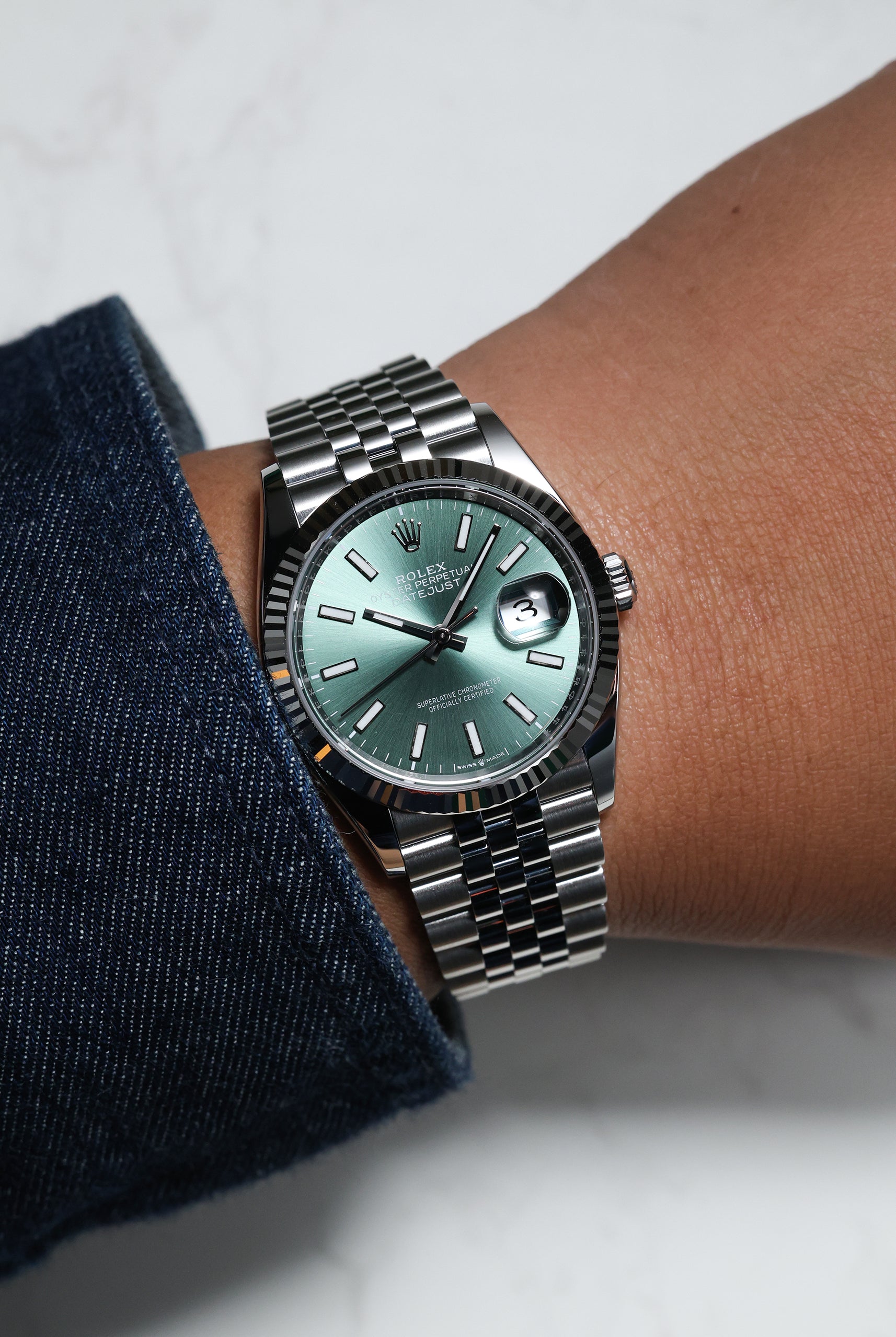
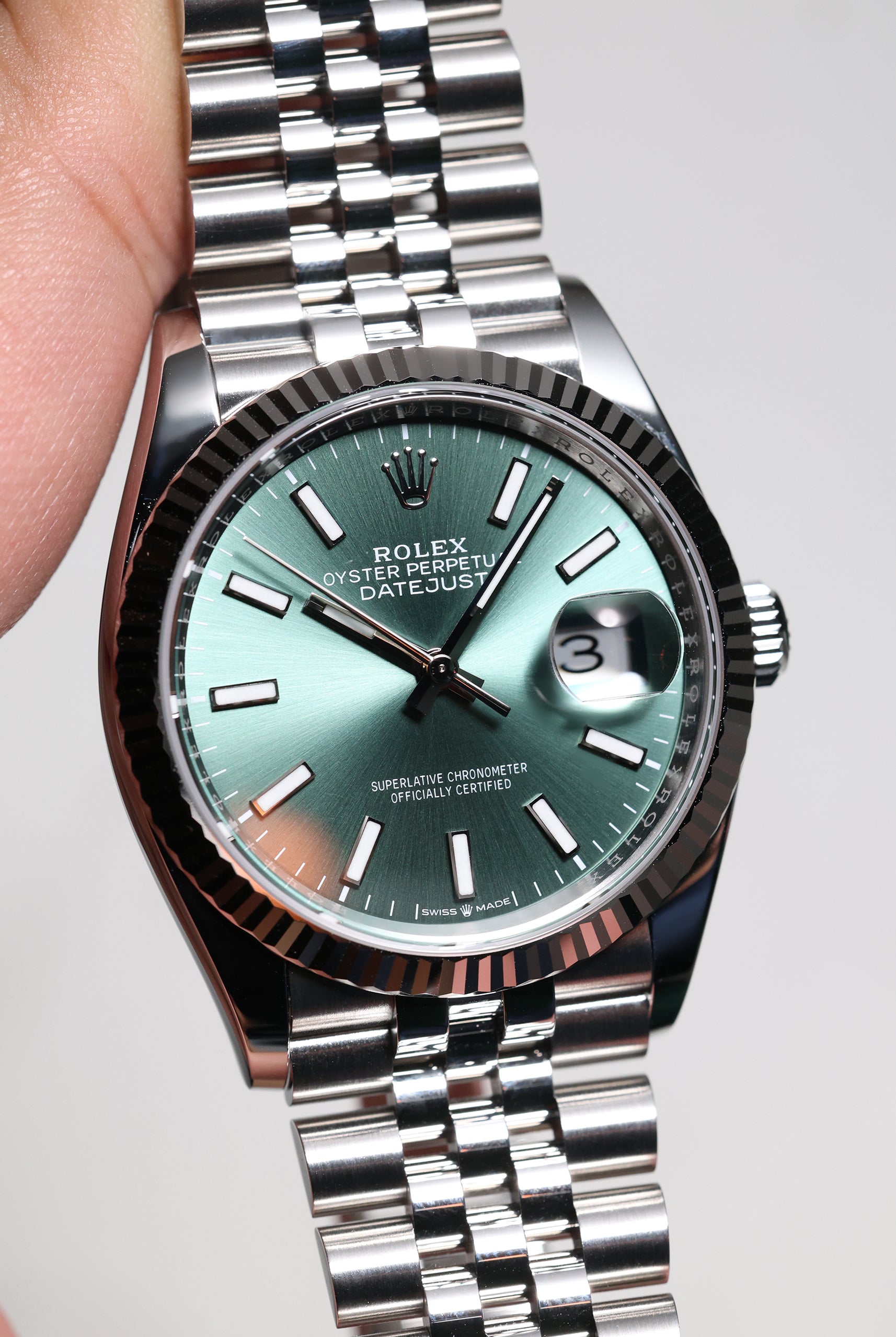
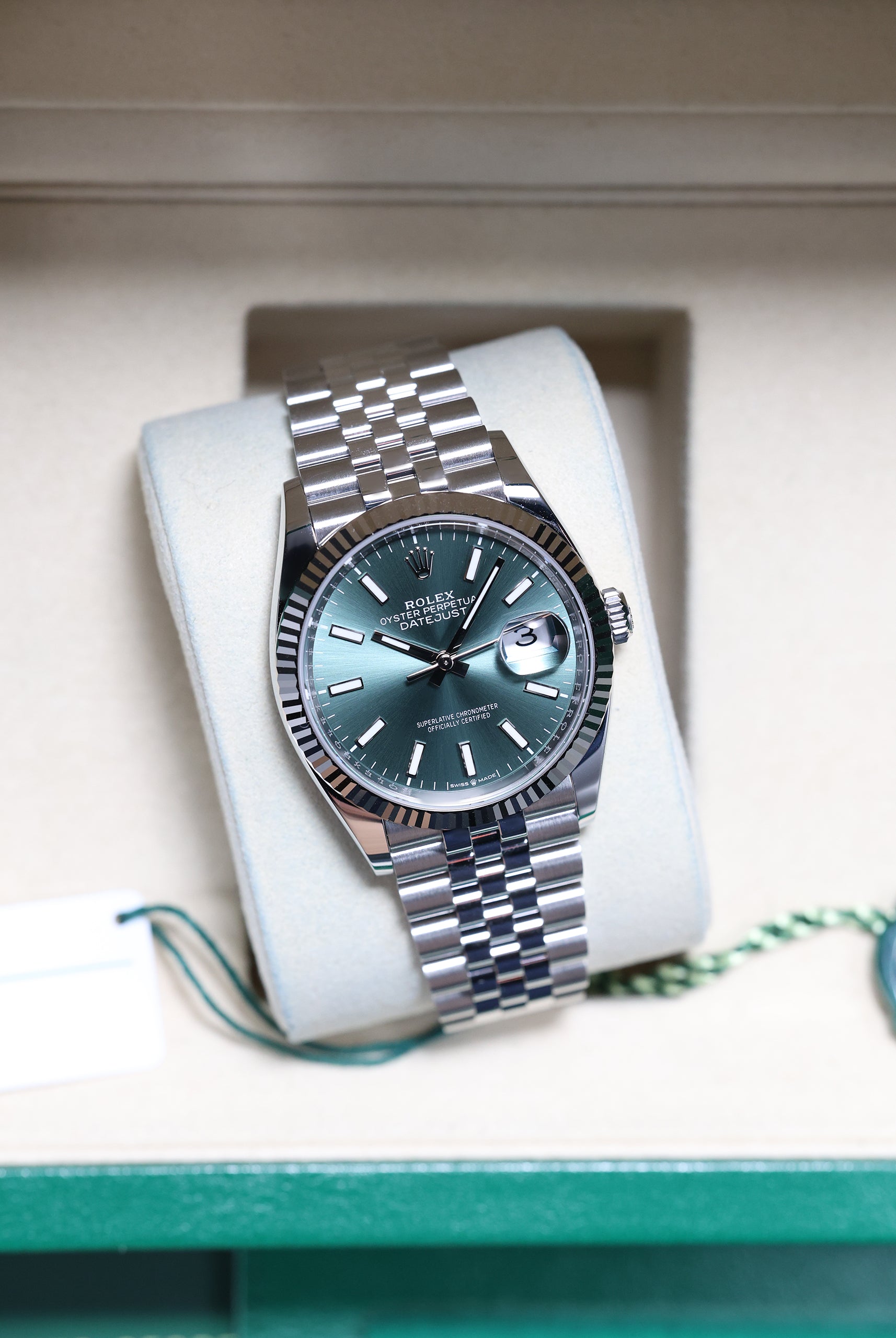
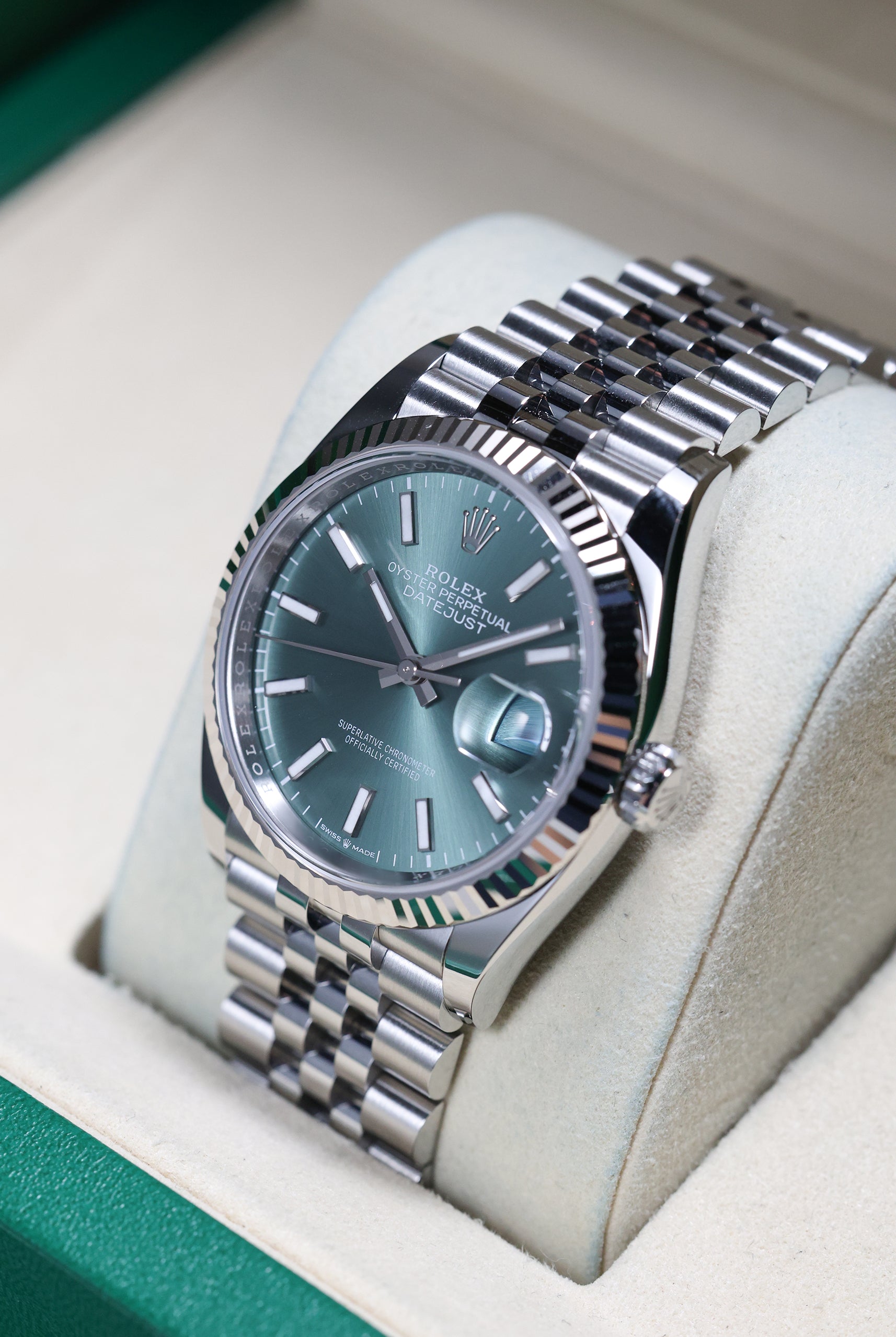
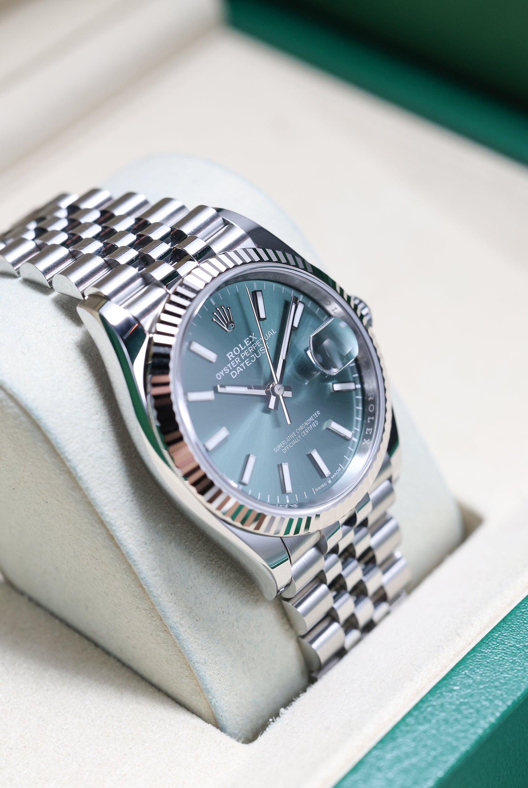
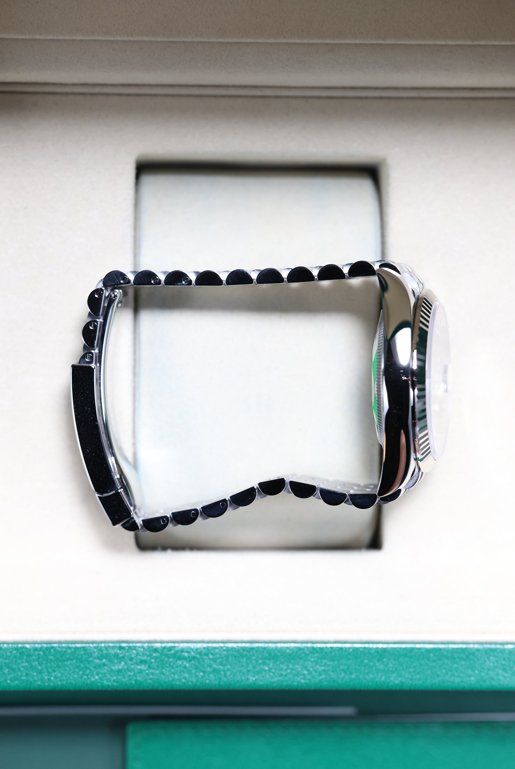
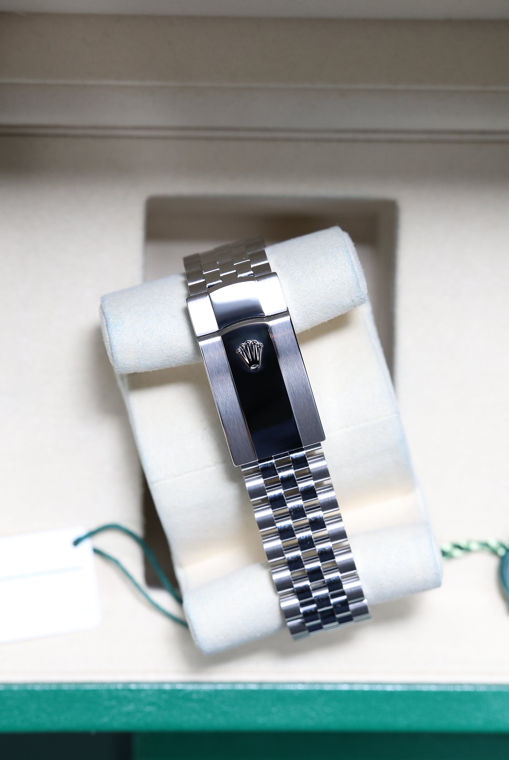
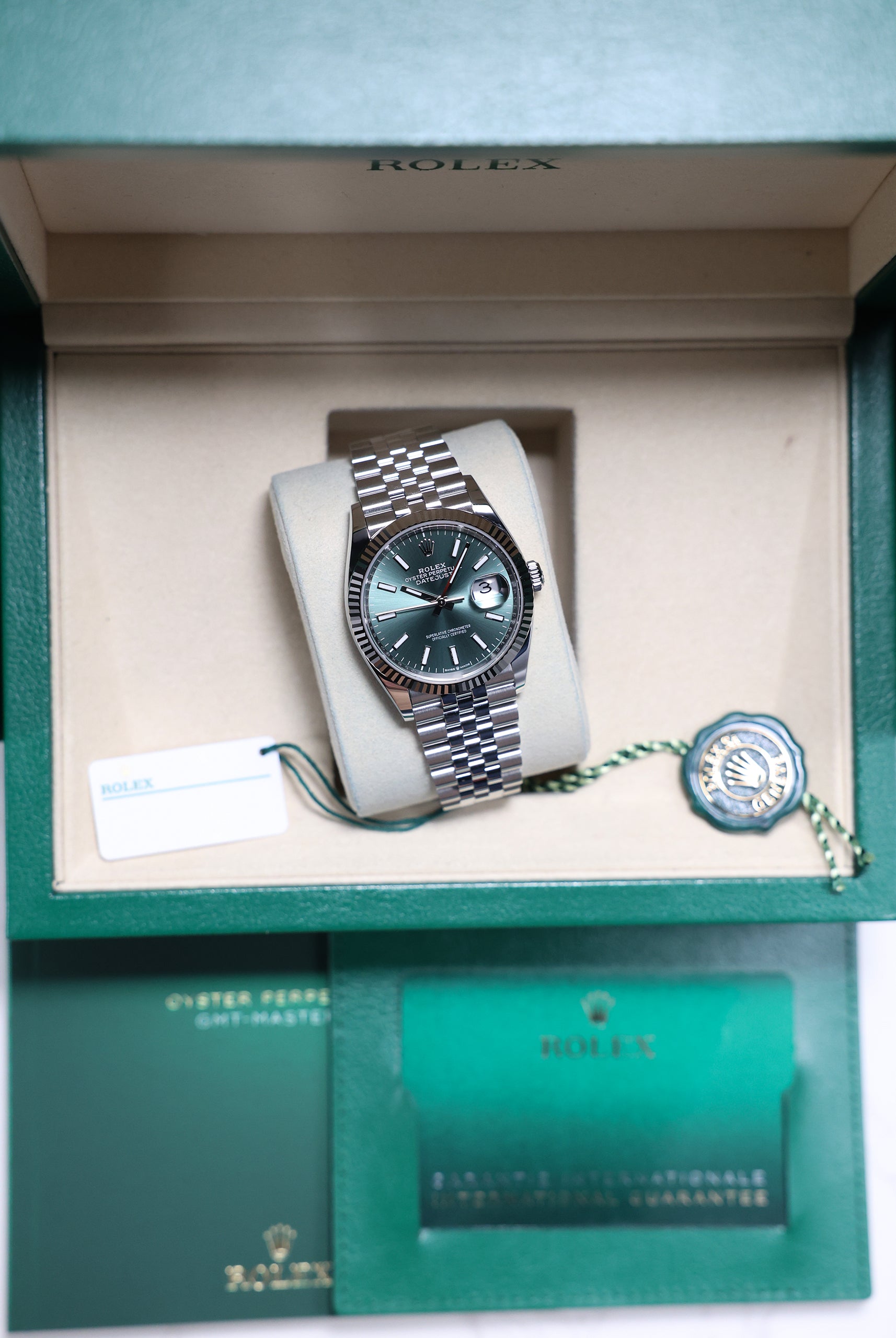
9. Rolex Datejust — Mint Green Dials (e.g., 126334)
For everyday elegance with quietly expressive character. Rolex’s mint green features a delicate sunburst finish beneath a high-gloss lacquer. This creates a soft, smooth effect that gives the Datejust a calming, distinctive presence. Versatile, effortless, and universally wearable, it’s a gentle, distinctive shade suited to any occasion, offering accessible, daily style.
Final Thoughts: Green as Watchmaking’s Most Expressive Colour
Green has become the new language of contemporary watchmaking. Through lacquer, matte, gloss, sunburst, and layered sapphire, the colour reveals personality in ways few others can. Each of these nine timepieces captures a different facet of green — sporty, dressy, sculptural, vintage, nuanced, or independent. For collectors exploring this evolving palette, these watches represent the strongest and most compelling expressions of green for 2025.
Which dial finish—matte, lacquered, or sunburst—do you feel best captures the essence of modern luxury, and what color do you predict will dethrone green next?
Explore our latest collection of green dials in stock and discover the timepiece which will suit you best.